Customizable SEO Dashboards: Your 2026 How-To Guide
Customizable SEO Dashboards: Your 2026 How-To Guide

You’re probably looking at three tabs right now. GA4 in one. Search Console in another. Maybe a ranking tool open somewhere else. Then Google Ads data is sitting off to the side like it belongs to a different department.
That’s how most reporting gets built, and it’s why most dashboards don’t get used.
Good customizable seo dashboards don’t show everything. They cut through tool sprawl, pull the right signals into one place, and make the next action obvious. The teams that get value from dashboards aren’t the ones with the prettiest charts. They’re the ones that know which numbers matter, which segments deserve their own view, and when to connect SEO data with PPC search term data instead of treating them like separate worlds.
There’s also a scale reason to take this seriously. BrightEdge says its customizable dashboards support over 6000 brands worldwide, reflecting how central flexible reporting has become in enterprise SEO, especially when teams need to track keywords, backlinks, traffic, conversions, and competitive movement in one place through BrightEdge customizable dashboard workflows.
Choosing Your North Star Metrics for SEO
Most bad dashboards fail before anyone opens Looker Studio, Power BI, or Tableau. They fail when the team says, “Let’s just pull in all the SEO metrics we have.”
That approach creates a junk drawer.
The fix is simple, but not always easy. Start with business outcomes, then work backward into the metrics that explain them. That means fewer vanity charts and more indicators that help someone decide what to do next.
Pick metrics that answer a real question
A useful dashboard should answer questions like these:
- Is organic search bringing qualified visits
- Are our important pages gaining or losing visibility
- Are technical issues blocking crawl, indexation, or page experience
- Which audience segments respond best
- Which search themes deserve more content or tighter optimization
The PushLeads guidance gets this right. Custom dashboards should use composite scoring systems instead of isolated metrics, and businesses with different customer types should create separate dashboard instances for each segment through PushLeads SEO dashboard metrics guidance.
Practical rule: If a metric doesn’t change someone’s priority list, it probably doesn’t belong on page one of the dashboard.
A single metric rarely tells the truth on its own. Traffic can rise while lead quality drops. Rankings can improve while conversions stay flat. CTR can look healthy while the wrong audience is landing on the page.
That’s why I like composite indicators for executive views and raw detail for analyst views.
Build one composite score on purpose
A Content Quality Score is a good example. Don’t make it a mystery number. Make it a weighted combination of the few signals that matter to your business.
For a lead generation site, that might combine:
- Engagement signals that suggest the page matches search intent
- Conversion behavior from organic visits
- Content freshness or coverage based on your editorial model
- Search visibility movement for the page’s primary topic cluster
For e-commerce, the weighting changes. For local service businesses, it changes again.
The point isn’t to build the perfect formula. The point is to stop making people mentally combine six charts every time they review performance.
Segment before you summarize
If you serve different customer types, don’t shove them into one top-line chart. Give each segment its own view.
That might mean:
- Residential vs commercial
- Brand vs non-brand
- Product line A vs product line B
- New market vs established market
This matters even more when teams care about lead quality, not just conversion count. A form fill from one page type might close well. Another may produce lots of low-value leads. Your dashboard should reflect that difference.
Here’s a simple KPI starter set.
Essential SEO Dashboard KPIs
| Category | KPI | Why It Matters | Data Source |
|---|---|---|---|
| Technical health | Crawl stats | Helps spot crawl inefficiency and errors that block discovery | Search Console or crawler |
| Technical health | Indexation metrics | Shows whether submitted URLs are actually getting indexed | Search Console |
| Technical health | Core Web Vitals | Flags page experience issues that often affect performance by device | Search Console or page experience data |
| Visibility | Keyword rankings | Tracks movement for target topics and page groups | Rank tracking tool |
| Visibility | Organic impressions | Shows whether Google is surfacing your pages more often | Search Console |
| Visibility | CTR | Reveals snippet and intent-match problems on pages already earning impressions | Search Console |
| Content performance | Top landing pages | Identifies pages driving organic entry and pages slipping | GA4 and Search Console |
| Content performance | Composite content score | Gives one summary indicator for page or cluster quality | Calculated field |
| Conversion quality | Organic conversions | Connects SEO to business activity | GA4 or CRM-connected reporting |
| Conversion quality | Lead quality indicators | Distinguishes volume from useful outcomes | CRM or sales data |
| Audience segmentation | Segment-specific performance | Shows which customer types respond best to SEO | Blended analytics and CRM data |
A lot of teams also need a separate keyword reporting layer so they don’t force that detail into the main dashboard. If that’s your bottleneck, this guide on SEO keyword reporting is worth pairing with your dashboard setup.
What to leave out
Some metrics aren’t bad. They’re just not first-screen metrics.
Leave these off the main view unless they support a clear use case:
- Every keyword variation
- Every page on the site
- Unsegmented total traffic
- Charts with no benchmark or target
- Metrics that nobody owns
A dashboard should make trade-offs visible. If everything is important, nothing is.
The strongest customizable seo dashboards are opinionated. They choose a few North Star metrics, separate audiences early, and keep detailed diagnostics one click away instead of cramming them into the homepage.
Selecting Your Dashboard Building Blocks
Tool choice is often overemphasized. Still, the wrong tool can turn a clean reporting idea into weekly maintenance.
I’d choose based on three things. Who needs to use it, how messy your data is, and how much transformation work you need before anything is chart-ready.

Looker Studio for fast marketing dashboards
Looker Studio is usually the first stop for marketers because it connects easily to Google properties and gets a working dashboard live quickly.
That’s the upside.
The downside is that it can get messy when you start blending multiple sources, standardizing naming, or trying to make one dashboard serve executives, SEO specialists, and PPC managers at the same time. It’s a presentation layer first. If your underlying data is inconsistent, the dashboard will inherit the mess.
Google Sheets for scrappy workflows
Sheets works better than people admit. For smaller teams, it’s fine for staging data, cleaning exports, and creating lightweight reporting layers before pushing them into a visualization tool.
It becomes painful when:
- Refreshes need to be automatic
- Multiple people edit logic
- Historical comparisons matter
- The dashboard has to scale across clients or business units
Use Sheets as a helper, not the final architecture, unless your operation is intentionally simple.
Power BI for structured analysis
Power BI makes sense when your team needs stronger data modeling and more controlled reporting logic. It’s a better fit than Looker Studio for organizations that already think in datasets, relationships, and governed metrics.
If you’re taking that route, these Power BI dashboard creation strategies are useful because they focus on structure and decision-making, not just visual polish.
Tableau for heavy customization
Tableau is still strong when analysis depth matters more than convenience. It can handle more complex exploration and interactive slicing than many marketing teams need.
That’s the issue. Plenty of teams buy a powerful tool, then build a dashboard that could’ve lived comfortably in Looker Studio. If your users just need recurring search performance views, Tableau may be more horsepower than you need.
A practical comparison
| Tool | Best fit | Main strength | Common trade-off |
|---|---|---|---|
| Looker Studio | Marketing teams using Google data | Quick setup and sharing | Harder to manage complex data logic |
| Google Sheets | Small teams and interim workflows | Flexible cleanup and simple calculations | Weak scalability |
| Power BI | Teams needing modeled data | Strong analysis structure | Steeper setup for marketers |
| Tableau | Analyst-heavy organizations | Deep exploration and customization | More complexity than many teams need |
If you want a good example of a high-level summary view before going deep into channel-specific reporting, HiveHQ's business overview dashboard is a useful reference for thinking about executive-facing layout.
For agencies comparing broader martech options, this roundup of the best tools for digital marketing agencies can help you decide where your dashboard stack should start and where it should stop.
The best tool is the one your team will still maintain six months from now.
Connecting Data and Building Your First Visuals
A dashboard usually goes sideways at the first join.
The pattern is familiar. Search Console is connected. GA4 is connected. A few charts look fine. Then someone asks why organic conversions dropped while clicks rose, or why a landing page shows in one table but disappears in another. The issue is rarely the chart. It is usually mismatched date settings, inconsistent page dimensions, or blended data that no one validated.
Start with source trust, then build visuals on top. SE Ranking’s SEO dashboard overview is a useful reminder that GA4 and Google Search Console still sit at the center of day-to-day SEO reporting. For a first build, those two sources cover the questions teams ask most often. Add PPC search term data later, but plan for it now so the structure does not need to be rebuilt when you want a unified search view.
Connect the core sources in the right order
For a basic SEO dashboard, start with:
- Google Search Console
- GA4
Search Console covers search visibility. GA4 covers post-click behavior. You need both, because neither source can explain performance on its own.
Use Search Console for:
- Queries
- Landing pages
- Impressions
- Clicks
- CTR
- Average position
Use GA4 for:
- Organic sessions
- Engaged sessions or your preferred engagement metric
- Conversions from organic traffic
- Landing page performance after entry
- User behavior by page or session
Keep the grain in mind. Search Console query data and GA4 landing page data do not line up neatly out of the box. That is why I recommend building your first views at the landing page level before trying to blend query-level SEO data with on-site engagement metrics.
Build the first version in layers
A simple build order saves a lot of cleanup later.
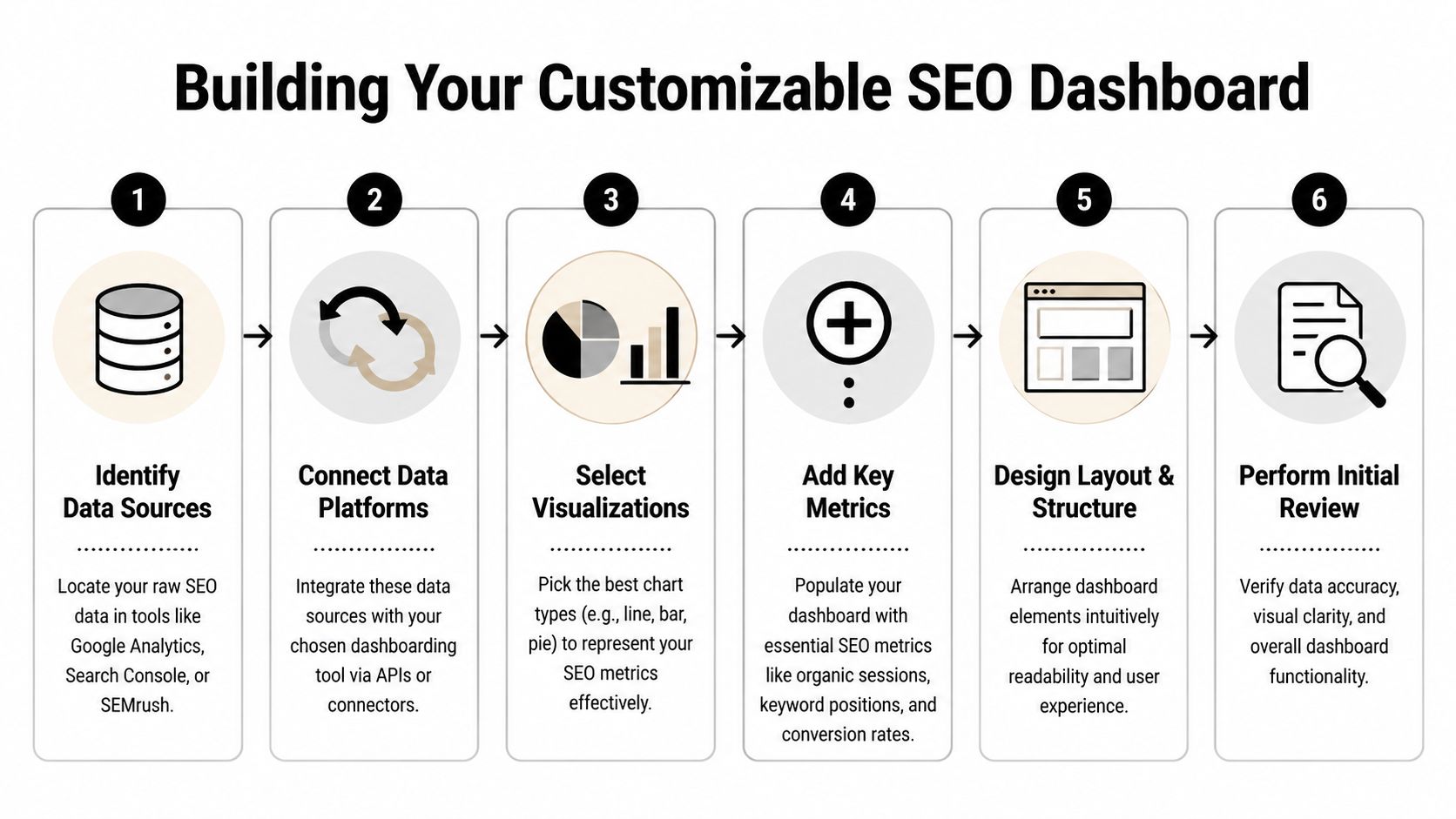
Use this sequence:
- Connect Search Console
- Connect GA4
- Align date ranges, properties, and page dimensions
- Create scorecards for a handful of KPIs
- Add one trend chart per data source
- Add one landing page table
- Reserve space for paid search terms if unified reporting is the goal
That last step gets missed. If you know you want SEO and PPC in one dashboard, leave room in the layout and data model for paid query themes, search term intent, and conversion comparisons. Keywordme is a practical example here because PPC search term exports can help validate which non-brand queries convert before SEO rankings catch up. That changes what you choose to chart first.
Keep the first visuals plain and easy to audit
The first dashboard should answer routine questions fast. It does not need clever design.
Start with top-line scorecards:
- Organic sessions
- Organic conversions
- Search Console clicks
- Search Console impressions
- CTR
Then add time-series charts. I prefer one line for GA4 organic sessions and a separate line for Search Console clicks or impressions. Mixed-axis charts tend to confuse non-analysts, and they hide tracking problems that are obvious when each source gets its own space.
Field note: annotate major site changes, content launches, and tracking changes. Without annotations, people explain every movement as an SEO win or loss.
Use one landing page table as your control panel
A landing page table does more work than a stack of small widgets.
Useful columns include:
- Landing page
- Clicks
- Impressions
- CTR
- Average position
- Organic sessions
- Organic conversions
This table surfaces three high-value cases quickly. Pages with impressions but weak CTR need title and snippet work. Pages with traffic but weak conversion rates need content or UX fixes. Pages with rising clicks and rising conversions usually deserve more content support and internal links.
Be careful with blended tables. If your platform handles joins poorly, keep Search Console and GA4 side by side instead of forcing them into one table too early. Clean comparisons beat messy unification.
If you are building inside a more modeled reporting environment, Power BI dashboard creation strategies can help with visual structure and data relationships.
Set up for SEO plus PPC reporting before you need it
This is the part many guides skip.
If the long-term goal is total search reporting, your first visuals should not trap SEO and PPC in separate logic. Leave room for a shared query taxonomy, brand versus non-brand rules, and page groups that work across both channels. Paid search term data is especially useful here because it exposes real user language faster than SEO tools usually do. A search terms report from Google Ads, cleaned and categorized in Keywordme, can become the bridge between PPC efficiency data and SEO opportunity tracking.
That matters in practice. PPC search terms can show commercial modifiers, local phrasing, and problem-aware language that never appears in a standard Search Console summary. If that taxonomy is built early, later comparisons become much easier: paid terms that convert but have weak organic coverage, organic pages earning clicks for terms that paid teams already know are low intent, and gaps where both channels are missing demand.
Use templates carefully
Templates can save setup time. They can also hard-code bad assumptions.
Common problems include:
- KPIs that do not match your business model
- Generic visuals with no page-level diagnostic value
- No clean path to add PPC search term data
- Confusing blends between Search Console and GA4
- Too many widgets for a first version
Use the template as a starting point, then cut anything that does not help answer a recurring business question. If GA4 is the weak point in your setup, this guide to Google Analytics organic search reporting is a good companion for sorting out landing page and conversion views.
Validate before you share
Check the basics before the dashboard reaches stakeholders:
- Date controls match across sources
- Properties and accounts are correct
- Landing page paths use the same format
- Organic totals are close to native platform totals
- Labels are clear to someone outside the SEO team
- Any future PPC fields have naming rules defined now
Here’s a useful walkthrough if you want a visual demo before building your own:
A plain first dashboard is usually the right one. If the joins are clean and the visuals answer real questions, people will keep using it.
Unlocking Advanced Insights with Filters and Segments
A dashboard becomes useful when a teammate can ask a sharper question without rebuilding the report.
That usually comes down to filters, segments, and a bit of discipline. If your dashboard only shows sitewide totals, it’s a status board. If it lets people isolate brand, device, page type, or service line, it becomes an analysis tool.

The technical side matters here too. Reportz recommends that technical SEO health dashboards track crawl stats, indexation metrics, and Core Web Vitals, with baseline benchmarks separated by device type and non-brand traffic tracked separately to understand lead quality in Reportz SEO KPI dashboard examples.
Separate brand from non-brand early
This is one of the highest-value segments in SEO reporting.
Branded traffic often behaves differently:
- Higher CTR
- Higher conversion intent
- Less useful as a pure SEO growth signal
Non-brand traffic tells you more about discoverability and category reach. If you mix both together, performance can look healthy while your actual SEO expansion is flat.
Add a filter or a toggle for:
- Brand
- Non-brand
- All search traffic
That one change usually improves dashboard discussions fast.
Device splits catch hidden problems
Desktop and mobile rarely behave the same way. This matters for both UX and technical diagnosis.
If mobile organic traffic underperforms, the problem might not be content. It could be page speed, layout, or interaction friction. Device filtering helps you test that without opening a separate report every time.
Create side-by-side views for:
- Mobile traffic and conversions
- Desktop traffic and conversions
- Core Web Vitals or page experience by device
- Top landing pages by device
Separate by device before you rewrite content. A lot of “content problems” are really mobile experience problems.
Build filters people will actually use
Most dashboards include too many filters. Keep the useful ones and drop the novelty ones.
Good defaults:
- Date range
- Brand vs non-brand
- Device
- Landing page group or page type
- Country or market
- Audience segment or service line
Weak filters usually include dimensions that nobody outside the analyst team understands.
Make actions visible next to insights
A dashboard that stops at diagnosis creates more meetings. Add a lightweight action layer.
That can be as simple as a note or linked workflow beside key charts:
- CTR below expectation. Review title tag and meta description.
- Traffic drop on a page group. Check indexing, internal links, and recent edits.
- Mobile decline. Review page templates and Core Web Vitals by affected URLs.
- Non-brand stagnation. Reassess topic coverage and search intent alignment.
You can also tie certain views to task owners. That’s often more valuable than adding another chart.
A practical segment stack
If your team is unsure where to start, use this order:
- Brand vs non-brand
- Desktop vs mobile
- Page type
- Service line or audience segment
- Country or region
That stack keeps the dashboard readable while still making it diagnostic.
The strongest customizable seo dashboards don’t just show the number. They let someone isolate the reason the number changed.
Combining SEO and PPC Data for Total Search Domination
This is the part most dashboard guides barely touch.
SEO and PPC teams often work from the same search behavior while reporting through separate systems. One team studies queries and landing pages. The other studies search terms, match types, wasted spend, and conversion paths. Then both teams make budget and content decisions with only half the evidence.
That split is expensive.

The demand is clearly there. Two Octobers notes that SEO and PPC dashboard integration is an underserved topic with 15,000+ monthly queries, and cites a 25% ROI uplift from integrated dashboards in a 2025 Ahrefs study, while pointing out that major tools still miss PPC-specific workflows in Two Octobers’ dashboard roundup.
What a unified search dashboard should actually show
Most “integrated” dashboards just place SEO charts next to Google Ads charts.
That isn’t integration. That’s co-location.
A useful combined search dashboard should connect signals across channels:
- Paid search terms that convert but lack strong organic visibility
- Organic queries with high impressions but weak paid coverage
- Search terms that should become negative keywords
- Landing pages pulling both paid and organic traffic
- Themes where SEO can reduce dependency on paid clicks
- Themes where PPC can validate demand before content investment
That’s the strategic layer. It’s not about stuffing more widgets into the page. It’s about letting one channel inform the other.
Where Keywordme fits
For PPC teams dealing with noisy search term reports, Keywordme can sit inside this workflow as the search term cleanup and expansion layer. It gives users a Chrome plugin interface for handling junk search terms, applying match types, and building negative keyword lists from real Google Ads search term data.
That matters because paid search term data is often the fastest way to spot:
- Queries that waste spend
- Commercial modifiers worth targeting in SEO
- Intent mismatches
- New ad group expansion opportunities
- Negative keyword candidates that also reveal weak content targeting
Once that data is visible next to organic landing page and query data, your SEO dashboard becomes much more useful.
A dashboard layout that works
I’d structure a unified search dashboard in three panels.
Search opportunity panel
This panel highlights overlap and gaps:
- Paid terms with conversions and poor organic presence
- Organic queries with traction but no paid protection
- Emerging themes from search term reports
Often, content planning and campaign expansion begin with this.
Waste and efficiency panel
This is the cleanup layer:
- High-cost irrelevant search themes
- Negative keyword candidates
- Pages receiving low-quality paid and organic traffic
- Intent groups that produce clicks but weak business outcomes
This panel is where PPC and SEO stop optimizing in isolation.
Landing page performance panel
This panel keeps both teams anchored on destination quality:
- Shared landing pages by channel
- Conversion behavior by source
- CTR and engagement mismatches
- Pages that need separate messaging for paid and organic traffic
When SEO and PPC disagree, check the landing page before you change the keyword strategy.
One practical example
Say your Google Ads search term data shows repeated commercial searches around a service modifier your site barely covers organically.
That creates at least three actions:
- Add negative keywords where the modifier is irrelevant to current paid targeting.
- Build or improve SEO content if the modifier matches a profitable offer.
- Test page messaging if the traffic lands but doesn’t convert.
That’s the kind of loop customizable seo dashboards should support.
If you work with hospitality or property marketing teams, this guide to SEO and PPC working together is a helpful outside example of how the channels can support one another instead of competing for attention.
What doesn’t work
A few dashboard habits tend to break unified reporting:
- Using different naming conventions across SEO and PPC
- Comparing broad topic buckets in one channel to exact terms in another
- Ignoring search intent
- Looking at clicks without conversion quality
- Treating negative keyword analysis as a PPC-only task
The payoff from integration comes from shared language and shared review. If the SEO team and PPC team can’t interpret the same chart the same way, the dashboard still has a silo problem.
From Data Overload to Actionable Decisions
A dashboard succeeds when people refer to it during decisions, not when they compliment the layout.
That’s why adoption is the ultimate finish line. You can build a technically clean, beautifully segmented reporting system and still get no value from it if nobody trusts it, understands it, or sees their role in it.
Design for the audience, not for yourself
Analysts like detail. Executives like direction. Account managers need a narrative they can repeat to clients. Those are different jobs, so they need different views.
A few practical rules help:
- Put the top-line takeaway first
- Use plain labels instead of tool jargon
- Limit homepage metrics to owned KPIs
- Push diagnostics into secondary tabs or pages
- Show targets or benchmarks where possible
If someone has to ask what a chart means every time they open it, the dashboard is unfinished.
Add commentary where numbers alone fall short
Raw charts are fine for analysts. Most other stakeholders need a sentence that explains the change and points to the likely reason.
Reporting Ninja highlights a growing need for scalable white-labeling and notes that its 2026 update introduced AI-driven commentary that explains what changed and why, with case studies showing a 35% boost in client retention in Reporting Ninja’s custom dashboard article.
That trend makes sense. Commentary turns dashboards from metric boards into decision tools.
Build a review habit
Dashboards get ignored when they’re detached from workflow.
Use them in recurring moments:
- Weekly SEO review
- Monthly channel planning
- Client performance calls
- Content prioritization meetings
- Technical issue triage
Don’t just send a link. Open the dashboard in the meeting and use it to guide the conversation.
A dashboard nobody opens during live decisions is just archived design work.
Ask for feedback like a product manager
The first version won’t be the right version. That’s normal.
Ask a few direct questions after people use it:
- What did you look at first
- What felt confusing
- Which chart changed your mind about a priority
- What did you still need to pull from another tool
Those answers tell you what to cut, what to rename, and what deserves a separate view.
For agencies, presentation matters
Agencies have an extra layer to manage. The dashboard isn’t only for internal decisions. It’s also part of client communication.
That’s where white-labeling and automated commentary can help, especially when you’re maintaining many client-specific views. But even without advanced automation, the principle is the same. Show the business impact, isolate what changed, and attach a recommendation.
The best customizable seo dashboards don’t feel like reports. They feel like shared operating systems for search performance.
If your dashboard work keeps running into a wall at the PPC layer, Keywordme is worth a look for handling Google Ads search term cleanup, negative keyword building, match type assignment, and campaign expansion data that can feed a more unified SEO and PPC reporting workflow.