7 Best PPC Reporting Examples To Steal For 2025
7 Best PPC Reporting Examples To Steal For 2025

Ever feel like you're wrestling a spreadsheet monster just to show campaign results? You're not alone. Crafting the perfect PPC report, one that clients actually understand and executives actually value, is a fine art. It's about more than just data dumps; it’s about telling a story of what's working, what's not, and where the next big win is hiding.
Instead of starting with a blank page, why not borrow from the best? We’ve curated a list of top-tier ppc reporting examples and templates that cut through the noise and get straight to the point. These aren't just pretty dashboards; they are strategic tools designed to communicate value, justify ad spend, and guide your next move.
In this guide, we'll break down exactly what makes each report effective, who it's for, and the specific KPIs you need to include. We’ll provide screenshots, links, and actionable takeaways so you can stop reinventing the wheel and start building reports that drive decisions. You'll learn how to transform raw numbers into compelling narratives for any audience, from in-the-weeds analysts to high-level stakeholders. Let's dive into the examples that will make your data sing.
1. Google Looker Studio Report Gallery
Kicking off our list is the one-and-only official Google Looker Studio Report Gallery. Think of it as a treasure trove of inspiration, offering a direct look at how other marketers visualize their data. Instead of starting from a blank slate, you can browse dozens of real-world PPC reporting examples submitted by the community, find a structure you like, and copy it directly into your own workspace with a single click.
It’s the ultimate shortcut for anyone new to Looker Studio or just looking for a fresh reporting perspective. If you're ready to start exploring, you can also easily sign up for Looker Studio.
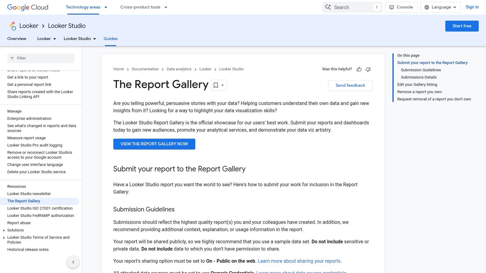
Why It Made the List
What makes the gallery so powerful is its accessibility and variety. You’re not just looking at static images; these are fully functional, copyable dashboards. This allows you to reverse-engineer complex reports, understand how certain charts are built, and see which key performance indicators (KPIs) others are prioritizing. The examples span everything from high-level executive summaries to granular, channel-specific deep dives for Google Ads, social media, and more.
Strategic Analysis & Actionable Takeaways
- For Client Reporting: Look for templates that blend high-level performance overviews (like ROAS and Cost per Conversion) on the first page with more detailed breakdowns on subsequent pages. This structure lets you present the bottom line first, then dive into the specifics if your client has questions.
- For Executive Dashboards: Filter for reports with a clean, minimalist design. Executives need the "so what" fast. Find examples that heavily feature scorecards for top-line metrics and trend lines showing month-over-month or year-over-year performance.
- For In-House Analysts: The real gold is in the complex, multi-source reports. Find a dashboard you like and click "Make a copy." This lets you see the exact data sources, blended data configurations, and custom formulas used to create the visuals, giving you a blueprint to replicate.
Pro Tip: While many reports are plug-and-play, they often require a third-party data connector to pull in your specific data from platforms like Facebook Ads or LinkedIn. Be prepared to configure these connectors (some are free, others are paid) to get the most out of a copied template.
While the gallery is a fantastic starting point, the ultimate goal is to build a report that truly reflects your campaign objectives. Diving deeper into the fundamentals will help you customize these templates effectively. For more on this, check out our guide on how to properly measure advertising effectiveness.
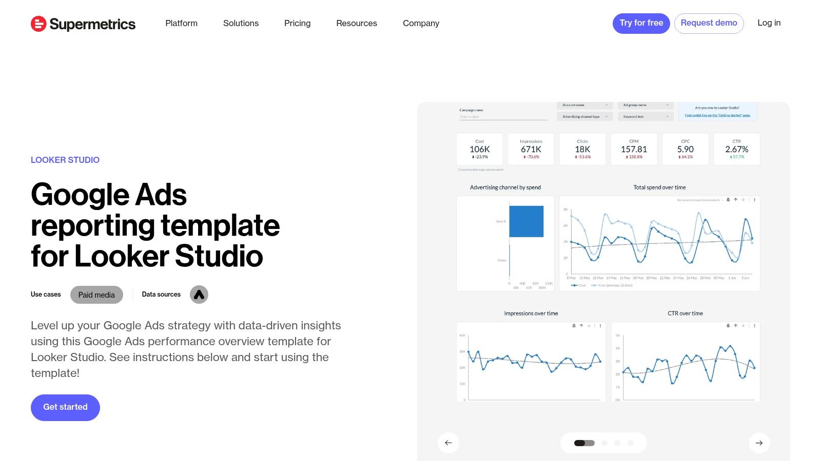
2. Supermetrics Template Gallery (Looker Studio Google Ads Template)
If you're looking for the fastest path from a blank page to a fully automated dashboard, the Supermetrics Template Gallery is your answer. While the Looker Studio gallery offers inspiration, Supermetrics provides a polished, plug-and-play solution powered by its robust data connectors. Their free Google Ads Performance template is a perfect starting point for creating comprehensive PPC reporting examples without the manual setup headaches.
This approach is ideal for agencies and in-house teams who value time and data reliability. Instead of wrestling with data source configurations, you get a clean, professional-looking report that’s ready to connect to your accounts and start pulling data automatically. It bridges the gap between a great template and the live, automated reporting that stakeholders expect.
Why It Made the List
Supermetrics excels at one thing: seamless data integration. While the template itself is excellent, its true power comes from the Supermetrics connector working behind the scenes. This eliminates the often-frustrating process of manually exporting CSVs or dealing with unreliable free connectors. The template provides a solid overview of core Google Ads metrics like clicks, conversions, CPC, and performance breakdowns by device and country, all within a visually appealing and easy-to-understand layout. The real value is getting this professional-grade report automated in minutes.
Strategic Analysis & Actionable Takeaways
- For Client Reporting: This template is a fantastic baseline for monthly client reports. Start with the overview page to show top-line results, then duplicate and customize tabs for specific campaigns or ad groups. The reliable data connection means your numbers are always accurate and up-to-date, building client trust.
- For Executive Dashboards: The clean design is perfect for leadership. The main dashboard highlights essential KPIs without overwhelming detail. You can easily copy the key scorecard widgets into a one-page executive summary that focuses purely on cost, conversions, and return on ad spend (ROAS).
- For In-House Analysts: Use this template as your foundation, then expand it. Since Supermetrics connects to over 150 data sources, you can pull in data from Facebook Ads, LinkedIn Ads, or your CRM to create a unified marketing performance dashboard. This lets you analyze the entire customer journey, not just PPC in isolation.
Pro Tip: The Supermetrics template is free, but the automation relies on its paid data connector. Sign up for the 14-day free trial to test the full workflow. Use this time to connect your Google Ads account, set up a daily data refresh, and see if the time saved justifies the subscription cost for your team.
Using a solid template is the first step, but customizing it to tell the right story is what truly matters. For more ideas on structuring your reports, explore our full collection of PPC reporting templates.
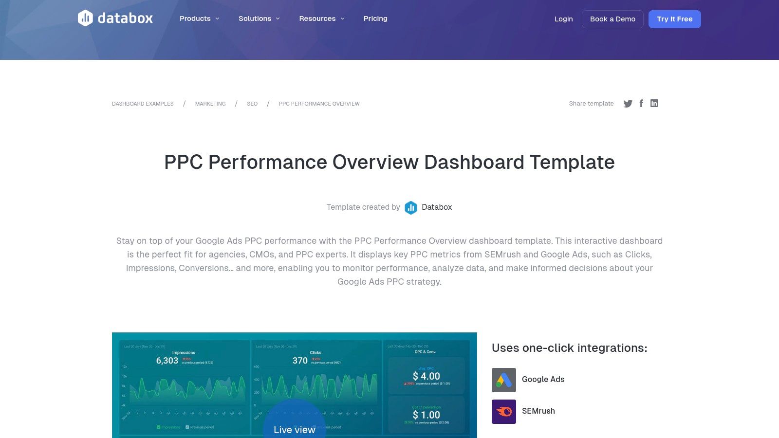
3. Databox
Next up is Databox because of its massive library of pre-built, plug-and-play dashboard templates. While Looker Studio offers a community gallery, Databox provides a curated, professionally designed set of PPC reporting examples that you can clone and populate with your own data in minutes. It's designed for speed and clarity, making it a go-to for agencies and in-house teams who need polished, real-time reports without a steep learning curve.
The platform is built around its 130+ native integrations, allowing you to pull data not just from Google Ads but from sources like SEMrush, social media platforms, and CRMs. This makes it incredibly easy to create a holistic performance overview that tells a complete story.
Why It Made the List
Databox excels at making data accessible and visually appealing, especially for those who aren't data visualization experts. Its templates are designed with specific roles in mind, so you can quickly find a dashboard tailored for a client, an executive, or a channel manager. The real-time data refresh and mobile app support are huge advantages, allowing stakeholders to check in on performance whenever they want, from wherever they are. While some advanced features are behind a paywall, you can start with a free plan to connect a few data sources and test out the templates.
Strategic Analysis & Actionable Takeaways
- For Client Reporting: Use the "Google Ads Performance" template to give clients a clean, one-page summary. It highlights top-line metrics like Impressions, Clicks, and Cost per Conversion alongside simple visualizations. The professional design builds trust and makes the data easy to digest, preventing clients from getting lost in spreadsheets.
- For Executive Dashboards: Combine data from Google Ads, Google Analytics, and your CRM into a single "Marketing Performance Overview" dashboard. Focus on high-level KPIs that tie directly to business goals, such as ROAS, lead volume, and customer acquisition cost (CAC). The ability to pull from multiple sources in one view is Databox's key strength for executive reporting.
- For In-House Analysts: Leverage Databox's "Goals" feature to track pacing against your monthly or quarterly targets. Set up automated alerts that notify you via Slack or email if a campaign's CPA goes above a certain threshold or if impression share drops. This turns your report from a static document into an active monitoring system.
Pro Tip: Don't just use the templates as-is. After cloning a dashboard, customize it by adding a "Text" block to include your own analysis and key takeaways. This small addition transforms a data dump into a strategic report, explaining what the numbers mean and what the next steps are.
Building a visually appealing report is only half the battle; ensuring it tells the right story is what truly matters. For more on structuring your data effectively, explore our guide on the ideal PPC report format.
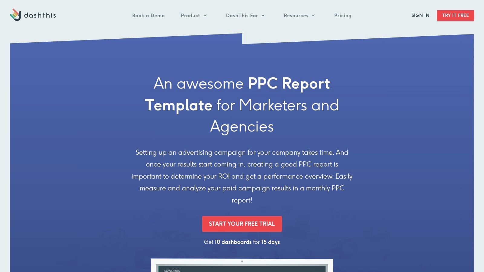
4. DashThis
Next up is DashThis, a platform built from the ground up for marketing agencies and professionals juggling multiple clients. It shines by simplifying the creation of beautiful, automated reports without requiring deep technical knowledge. DashThis provides a gallery of pre-built PPC reporting examples and templates for every major platform, from Google and Microsoft Ads to Meta and LinkedIn, allowing you to get a client-ready dashboard live in minutes.
The platform is engineered for efficiency, focusing on features that save agencies time. With drag-and-drop widgets, white-labeling options, and automated email dispatches, it removes the manual grind from monthly reporting. This focus on agency workflow makes it a go-to for teams needing to scale their reporting process without scaling their headcount.
Why It Made the List
DashThis earns its spot for its sheer speed and simplicity, especially for agency users. While tools like Looker Studio offer infinite customization, DashThis offers streamlined implementation. Its pre-built widgets are designed with marketing KPIs in mind, meaning you don't have to build charts for CTR, CPC, or ROAS from scratch. The platform's major selling points are its robust white-labeling features and automated report delivery, which are critical for maintaining brand consistency and professionalism across a large client base.
Strategic Analysis & Actionable Takeaways
- For Client Reporting: Leverage the pre-built Google Ads template as your foundation. Customize it by adding your client’s logo and brand colors using the white-label features. Set up automated monthly email sends so clients receive their performance snapshot on the first of every month like clockwork, reinforcing your agency's reliability.
- For Executive Dashboards: Use the "comment" widget strategically. Place comments next to key charts (e.g., a sudden spike in CPA) to add your expert analysis directly within the report. This pre-answers executive questions and transforms the dashboard from a data dump into a strategic narrative.
- For In-House Analysts: Take advantage of the multi-channel report templates. Combine data from Google Ads, Facebook Ads, and LinkedIn Ads into a single view. This is perfect for providing a holistic overview of paid media performance without forcing stakeholders to log into multiple platforms or review separate reports.
Pro Tip: DashThis's pricing is based on the number of dashboards. To manage costs, create a master "template" dashboard for a specific service (e.g., "Standard Google Ads Report") and clone it for each new client. This standardizes your reporting and prevents you from building every new report from scratch, saving both time and money.
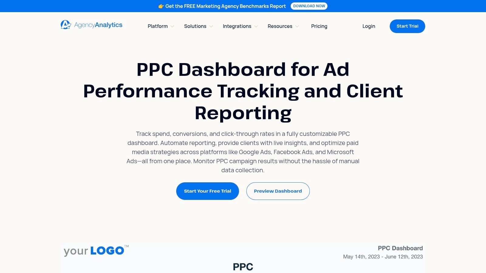
5. AgencyAnalytics
For marketing agencies juggling multiple clients, creating bespoke reports from scratch is a massive time sink. This is where AgencyAnalytics steps in, offering a purpose-built platform designed specifically for agency-scale reporting. It’s an all-in-one command center that automates data collection from over 80 platforms and presents it in clean, white-labeled dashboards that look like you spent weeks building them.
The platform comes loaded with pre-built templates, including several fantastic PPC reporting examples that you can deploy instantly. These templates cover everything from high-level performance summaries for Google Ads and Microsoft Ads to granular campaign breakdowns, saving you countless hours and letting you focus on strategy instead of spreadsheets.
Why It Made the List
AgencyAnalytics excels at streamlining the entire client reporting workflow. Its key strength lies in its agency-first features: white-labeling, automated report scheduling, and secure client portals. You can give each client their own login to a branded dashboard, giving them 24/7 access to their data while you maintain full control over what they see. The platform also offers roll-up dashboards, allowing you to see aggregated performance across all your clients at a glance, which is a lifesaver for agency owners.
Strategic Analysis & Actionable Takeaways
- For Client Reporting: Leverage the white-labeling feature to its fullest. Add your agency’s logo, customize the color scheme, and set up a custom domain for the client portal. Use the automated report scheduling to send PDF summaries every week or month, ensuring your clients always feel informed and see the value you’re providing.
- For Executive Dashboards: The roll-up dashboard is your best friend. Configure it to display top-line metrics like total ad spend, total conversions, and blended ROAS across your entire client portfolio. This gives you a powerful, 10,000-foot view of your agency’s health and client performance without needing to log into multiple accounts.
- For In-House Analysts: The real value is in the integrations and annotations. Connect all your PPC channels (Google, Facebook, LinkedIn, Amazon, etc.) into a single dashboard. Use the annotation feature to mark important dates like campaign launches or budget changes directly on the charts, providing crucial context for performance spikes or dips.
Pro Tip: Use the AI-powered "Report Summaries" feature to save time on writing commentary. It automatically analyzes the data in your report and generates a natural language summary of key trends and insights, which you can then edit and customize before sending it to the client. This is a huge efficiency booster for agencies managing dozens of accounts.
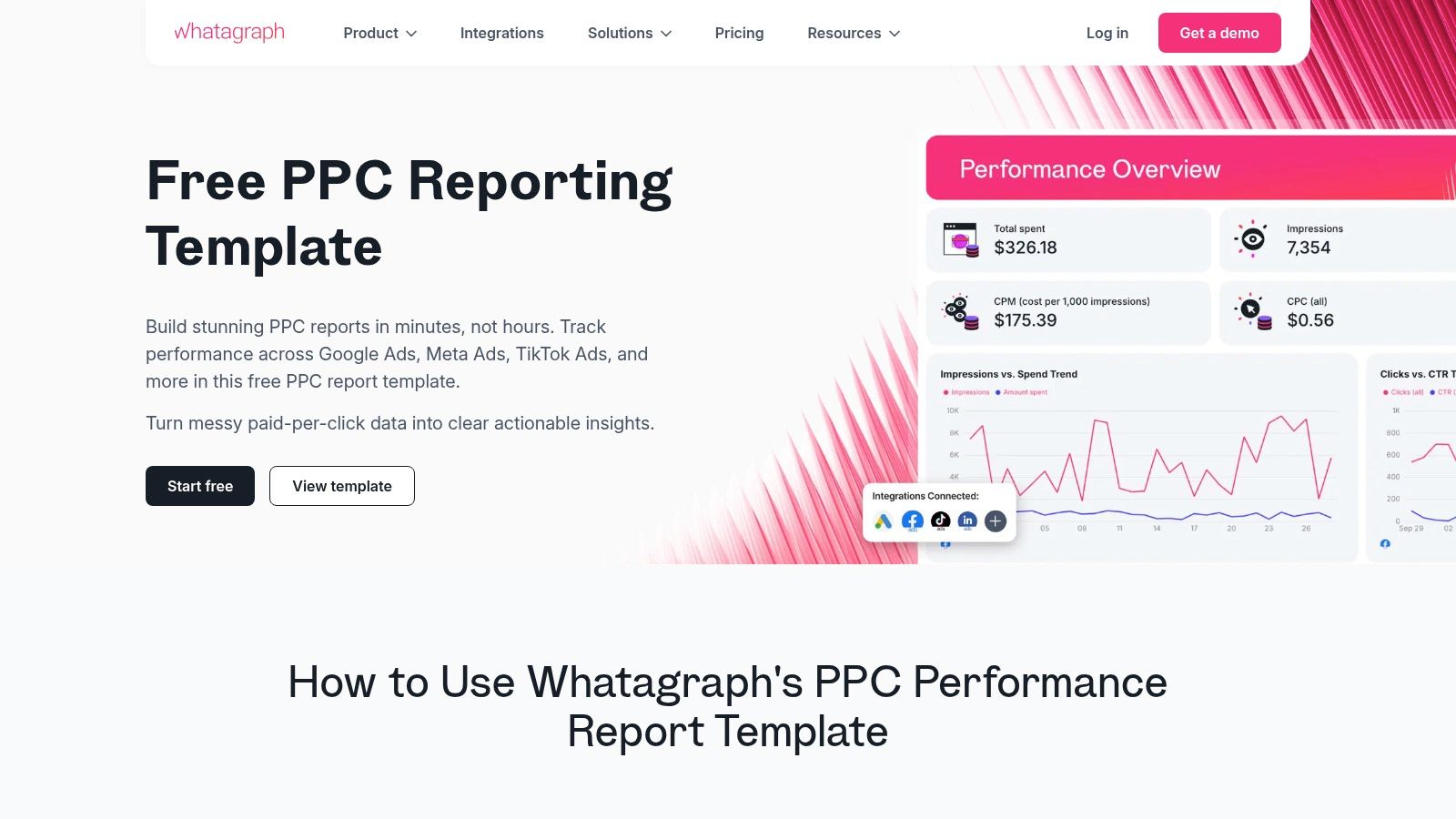
6. Whatagraph
Next up is Whatagraph, a powerful cross-channel reporting tool designed for agencies and in-house teams who need to consolidate data from multiple platforms quickly. Think of it as your all-in-one hub for pulling data from Google Ads, Meta, TikTok, and LinkedIn into a single, cohesive narrative. Its strength lies in its pre-built templates and automation features, which drastically cut down the time it takes to build and share professional-looking PPC reporting examples.
Whatagraph also introduces an AI assistant, Whatagraph IQ, to help generate insights and report summaries, making the analysis process even faster. It's built for speed and scale, allowing you to manage and report on numerous client accounts without getting bogged down in manual data pulls.
Why It Made the List
Whatagraph excels at multi-channel PPC reporting, something that can be a major headache with native platform tools. Its key advantage is the seamless integration of disparate data sources into visually appealing, easy-to-understand dashboards. For agencies, the white-labeling and automated report delivery features are game-changers, allowing you to send branded, scheduled PDF reports directly to clients' inboxes. The platform is designed to make you look good with minimal recurring effort.
Strategic Analysis & Actionable Takeaways
- For Client Reporting: Leverage the cross-channel PPC report templates to show clients a holistic view of their paid media performance. Start with a summary page displaying blended KPIs like Total Spend, Total Conversions, and Overall CPA. Then, use separate pages for each platform (Google Ads, Facebook Ads, etc.) to detail channel-specific metrics. This structure answers the big-picture questions first before diving into the weeds.
- For Executive Dashboards: Use the drag-and-drop builder to create a high-level "PPC Health" dashboard. Focus on widgets that show top-line metrics and period-over-period trends. The AI-powered summaries can generate a concise text overview of performance, which is perfect for busy executives who need the key takeaways without analyzing charts.
- For In-House Analysts: The real value is in monitoring multi-platform campaign performance in near real-time. Set up a live dashboard that pulls in data from all active campaigns. Use this to spot anomalies quickly, like a sudden spike in CPA on one platform or a drop in CTR on another. This allows for faster optimization decisions across your entire paid media portfolio.
Pro Tip: When setting up automated reports for clients, customize the delivery schedule based on their needs. A weekly snapshot might be perfect for a hands-on client, while a monthly roll-up is better for those who just want the high-level summary. Use the white-label feature to add your agency's logo and custom domain for a fully branded experience.
7. ReportGarden
For agencies looking to streamline their client communication, ReportGarden is a purpose-built PPC reporting and dashboard tool. It focuses on taking the manual labor out of reporting by offering a suite of pre-built templates, automated scheduling, and client-friendly features like white-labeling and dedicated client portals. It’s designed for speed and efficiency, helping you create professional-looking reports without the steep learning curve of more complex BI tools.
The platform integrates with all the major players like Google Ads, Microsoft Ads, and Meta, allowing you to pull cross-channel data into a single, cohesive view. Think of it as an assembly line for your weekly or monthly PPC reporting examples, letting you set up a template once and have it automatically populate and send to clients on a recurring schedule.
Why It Made the List
ReportGarden’s strength lies in its agency-centric design and affordability. While platforms like Looker Studio are incredibly powerful, they can require significant setup time. ReportGarden prioritizes getting a polished, client-ready report out the door as quickly as possible. Its drag-and-drop interface and library of templates mean you can go from data connection to a finished report in minutes, not hours.
The white-labeling is a huge plus for agencies wanting to maintain brand consistency across all client touchpoints. This feature, combined with automated report scheduling and client portals, positions it as a complete client management solution, not just a reporting tool.
Strategic Analysis & Actionable Takeaways
- For Client Reporting: Use the "Scheduled Reports" feature to automate your weekly and monthly reporting cadence. Select a template that visualizes key PPC metrics like CPA, ROAS, and Conversion Rate, and add your agency’s logo using the white-label function for a professional touch.
- For Executive Dashboards: Leverage the client portal feature to create a live, high-level dashboard. This gives stakeholders 24/7 access to top-line performance metrics without needing to wait for a static PDF report, offering transparency and reducing back-and-forth emails.
- For In-House Analysts: Take advantage of the custom metrics and data blending capabilities. If you’re tracking a specific lead-to-MQL rate, for instance, you can create a custom formula that pulls in data from both your ad platforms and a separate CRM source (via Google Sheets or another integration) to calculate and visualize it directly within the dashboard.
Pro Tip: When setting up reports for a new client, start with one of ReportGarden's pre-built templates for Google Ads or Facebook Ads. Customize it by adding a text widget on the first page to provide a concise executive summary with your key insights and next steps. This adds a layer of human analysis that automated reports often lack.
Top 7 PPC Reporting Tools Comparison
Beyond the Dashboard: Turning Reports Into Action
We’ve walked through a ton of incredible PPC reporting examples, from the visual storytelling of a Google Looker Studio dashboard to the agency-focused powerhouses like AgencyAnalytics and Whatagraph. Each tool offers a unique way to slice, dice, and present your campaign data. But let's be real, a pretty report is just a pretty report until you do something with it. The ultimate goal isn't to create a beautiful document; it's to use that document to drive tangible results and make smarter decisions.
The true power of effective PPC reporting lies in its ability to close the loop between data, insight, and action. Your report might tell you what happened, like a sudden spike in Cost Per Acquisition (CPA) in a specific campaign. But the real money is made when you uncover why it happened and how to fix it. This is where the beautiful dashboard ends and the real work begins.
From Data Points to Action Plans
Think of your report as the diagnostic tool. It’s the X-ray that shows you where the problem is. The tools we’ve covered are fantastic at producing that X-ray. Supermetrics can pull in complex data blends, DashThis can deliver a clean client-facing summary, and Databox can give you a real-time pulse on your KPIs. They excel at flagging the anomalies and highlighting the trends.
But once your report flags that underperforming ad group or a campaign with runaway ad spend, you need a scalpel, not another chart. This is the moment you transition from reporting to optimization. The most successful PPC managers don't just admire their dashboards; they use them as a launchpad for deep-dive analysis.
Key Takeaway: Your report’s primary function is to ask intelligent questions. A drop in CTR isn't just a data point; it's a question: "Is our ad copy no longer relevant, or is a new competitor bidding on our top keywords?" A high impression share with low conversions asks: "Are we targeting the wrong audience, or is our landing page failing to deliver?"
Connecting the Dots for Maximum Impact
The best ppc reporting examples are those that directly inform your next steps. Let’s make this practical. Imagine your executive report shows that overall lead quality has decreased, even though conversion volume is stable. The report has done its job. Now what?
- Isolate the Source: Dive into your campaign-level report. Which campaigns are driving these lower-quality leads?
- Dig into the 'Why': This is where a tool built for deep keyword analysis becomes crucial. Export the search term data from the problem campaigns. Are you showing up for broad, informational queries instead of high-intent, transactional ones?
- Take Decisive Action: Use your findings to build a precise negative keyword list to cut out the waste. Simultaneously, identify the high-intent search terms that are working and double down on them by creating new, tightly-themed ad groups.
This workflow, moving from a high-level report to granular optimization, is what separates average campaigns from highly profitable ones. You’re not just reporting on the past; you’re actively shaping the future performance of your account. The tools we explored give you the framework, but the strategic action you take based on that data is what truly moves the needle. Ultimately, the report is the map, but you still have to drive the car.
Tired of manually sifting through messy search term reports after your dashboard flags a problem? Keywordme is the tool that bridges the gap between insight and action, helping you instantly analyze search query data to find wasteful spend and uncover hidden keyword opportunities. Turn your reporting insights into profitable optimizations in a fraction of the time with Keywordme.