Mastering the PPC Report Format for Better ROI
Mastering the PPC Report Format for Better ROI

A solid PPC report format isn't just a spreadsheet full of numbers. It's a story. It’s the tool that turns raw data on clicks and costs into a clear narrative about business growth. The best ones I've seen are always built for a specific audience—big-picture results for the execs, and nitty-gritty details for the folks in the trenches.
Why Your Current PPC Report Format Is Broken
Let's get real for a second. That generic, one-size-fits-all report you're probably sending? It’s not just boring; it’s likely hiding major opportunities and quietly costing you money. When a report doesn't tell the real story behind your ad spend, it leads to bad decisions and a budget that just seems to evaporate.
A broken report format becomes a weekly chore instead of your most powerful tool for optimization.

So many of these outdated reports fall into the same traps. They’ll shout about vanity metrics like impressions and clicks but whisper when it comes to actual revenue or qualified leads. This gives everyone a false sense of security while the budget gets funneled into campaigns that are going nowhere.
The High Cost of Poor Reporting
The fallout from a bad PPC report format is no joke. Without clear, audience-specific insights, stakeholders can't see the true return on investment, and your hard work goes unnoticed.
Just look at some recent Google Ads benchmarks. The average cost per click (CPC) is now $5.26 across all industries. But if you're a law firm, that CPC can rocket up to $8.58. A generic report just mushes all these costs together. A good one, however, isolates those high-cost campaigns and forces you to ask the tough questions about their ROI.
This is how you spot the money pits before they completely drain your budget. A great place to start cleaning house is with our comprehensive PPC audit checklist and template.
A great report doesn't just present data; it provokes action. It should immediately answer two questions: "What's working and why?" and "What's not working and what are we doing about it?"
Moving Beyond Vanity Metrics
A truly effective report format changes the entire conversation. It moves you away from talking about simple activity ("we got a lot of clicks!") to discussing tangible business outcomes ("we generated X leads at Y cost").
Your goal is to build a report that tells a compelling story, one that pinpoints waste and illuminates new paths for growth. A better format will help you:
- Spotlight Wasted Spend: Instantly see which keywords or ad groups are eating up your budget with little to no return.
- Drive Strategic Conversations: Give the right data to the right people, so you can have meaningful discussions about where to allocate the next dollar.
- Connect Ad Spend to ROI: Clearly show how your PPC efforts are fueling the bottom line, making it easy to justify your budget and your job.
Once you start building reports based on what different stakeholders actually need to see, you'll find it’s no longer just a task to check off. It becomes your most valuable weapon for building smarter, more profitable campaigns.
Tailoring Reports for Different Audiences
Ever tried explaining click-through rates to a CEO who just wants to know if you're making them money? Yeah, we've all been there. Handing over the same dense, stat-filled report to everyone is a classic mistake. It's a surefire way to get your hard work ignored.
The secret to a great PPC report isn't just the data; it's about telling the right story to the right person. Your audience dictates everything. Your CEO doesn't need to get lost in keyword-level performance, and your campaign manager can't do their job without it.
So, let's break down how to build reports for the two main groups you'll be dealing with: the decision-makers and the doers.
The Executive Snapshot Report
Your executive audience—CEOs, VPs of Marketing, clients—they live at 30,000 feet. They don't have time to wade through the weeds of ad group performance. They care about one thing: business impact. Is this investment growing the company?
Your report for them needs to be clean, visual, and get straight to the point. Think of it as a high-level dashboard that answers their most pressing questions in 60 seconds or less.
Focus on the big-picture metrics that connect directly to their goals:
- Return on Ad Spend (ROAS): This is the king of all metrics for execs. For every dollar we put in, how many did we get back?
- Cost Per Acquisition (CPA): How much are we paying for each new customer? Is this cost-effective and sustainable?
- Total Conversions & Revenue: The top-line numbers that show growth and prove the channel is working.
- Budget Pacing: A simple visual showing if we're on track with our spending for the month or quarter.
Use trend lines, simple charts, and big, bold numbers to make the key takeaways impossible to miss.
The goal of an executive report is to build confidence and guide strategic decisions, not to get bogged down in technical jargon. Keep it simple, visual, and focused on business outcomes.
The Tactical Deep-Dive Report
Now for your tactical team—the campaign managers and PPC specialists who are in the trenches every day. While the execs need the "what," this team needs the "why" and the "how." They need all the granular details to find what's working, fix what isn't, and spot the next big opportunity.
This report is less about flashy visuals and more about actionable data. It's the blueprint they'll use to make daily optimizations.
Here's what you absolutely have to include for your tactical crew:
- Campaign & Ad Group Performance: A detailed breakdown of clicks, CTR, CPC, and conversion rates for each campaign and ad group.
- Keyword & Search Query Analysis: Which keywords are driving the best leads? Which ones are just burning cash?
- Ad Copy Performance: Show the results from A/B tests. Which message is actually getting people to click and convert?
- Audience & Demographic Insights: Who are we reaching? Which audiences are performing best?
- Device & Network Breakdowns: Are mobile ads crushing it? Is the Search Network driving more value than Display?
This is the playbook. It gives your team the intel they need to make smart, data-driven moves that improve performance day after day.
Executive vs. Tactical PPC Report Metrics
To make it crystal clear, here’s a breakdown of what metrics matter most to each audience and why. One report focuses on the big-picture business impact, while the other provides the granular data needed for day-to-day optimization.
Ultimately, providing both types of reports ensures everyone from the C-suite to the campaign manager has exactly what they need to succeed. The executives stay informed and confident, and the tactical team stays empowered to drive results.
Choosing the Core Metrics That Actually Matter
Alright, you know who you’re talking to. Now let's get down to the good stuff: what numbers actually belong in your report.
A truly solid PPC report format cuts through the noise. Forget getting bogged down in vanity metrics like clicks and impressions. We're here to talk about what actually moves the needle for the business. Your report's foundation needs to be built on key performance indicators (KPIs) that tell a clear story about growth and profitability.
These are the metrics that answer the "so what?" behind all your hard work. They don't just show activity; they prove results.
The Power Trio of PPC Metrics
Look, you can track dozens of data points, but I’ve found that every great report really hinges on three core metrics. Get these right, and you've got the most important part of the story covered.
- Conversion Rate: This is your gut check. It tells you what percentage of people who click your ad actually do the thing you want them to do. It’s the ultimate measure of how well your ads and landing pages are working together.
- Cost Per Acquisition (CPA): This is your efficiency metric. How much did it cost, in real dollars, to get that new customer or lead? If you don't know your CPA, you're flying blind on a budget.
- Return on Ad Spend (ROAS): The king of them all. For every dollar you put in, how many did you get back? ROAS directly ties your ad budget to revenue, which is the language every executive speaks.
Focusing on this trio completely changes the conversation. You stop talking about "how many clicks we got" and start talking about "how much business we generated." For a deeper dive, check out our guide on how to measure advertising effectiveness.
Adding Context to Your Data
Numbers on their own are pretty useless. A Quality Score of 8/10 means nothing without context.
But what if you show how that Quality Score trended up over the last quarter, leading to a 15% decrease in your average Cost Per Click (CPC)? Now that's a story. That’s an insight that shows your optimization efforts are paying off.
The same idea applies to how you slice up your data. Don't just report on the campaign as a whole. Break it down to find the hidden gems.
A great PPC report doesn't just present data; it interprets it. By segmenting your metrics, you can transform a simple number into an actionable insight that guides future strategy.
For example, we know from research that paid search now drives 27.6% of all new website visitors globally, which is huge. But a smart report will go further and show which specific devices, locations, or ad networks are driving your share of that traffic. That’s how you find out where to double down. If you're curious about the data, you can read the full research on these and other PPC statistics from Cropink.
By adding these layers of context and segmentation, your report stops being a boring, static document. It becomes a strategic tool that helps you—and your stakeholders—make smarter decisions. You'll start spotting trends and opportunities that a basic, surface-level report would completely miss.
Visualizing Data to Tell a Compelling Story
Let's be honest: a spreadsheet crammed with numbers is where good intentions go to die. Nobody wants to read that. But a sharp visual? That tells a story in a heartbeat. This is where your PPC report format stops being a data dump and starts becoming a narrative that gets people nodding along.
Turning raw numbers into charts that make sense at a glance is your secret weapon. It’s one thing to say the ROAS is 3.5; it’s another to show a line chart where that metric is climbing steadily month over month. Visuals make trends, big wins, and potential problems jump right off the page, letting your stakeholders get the gist without drowning in the details.
Choosing the Right Chart for the Job
Not all charts are created equal, and picking the right one is crucial. You have to match the visual to the data you're trying to explain. Think about the point you’re trying to make, then choose the chart that tells that story most effectively.
Here are my go-to choices:
- Line Charts for Trends: Want to show how CPA has improved over the last six months? A line chart is your best friend. It’s the easiest way to spot trends, seasonality, or the immediate impact of a campaign change.
- Bar Charts for Comparisons: Trying to show which ad group is driving the most conversions? A bar chart is perfect. It gives a clean, immediate comparison of metrics like clicks, spend, or conversions across different campaigns or channels.
- Pie Charts for Allocation: I use these sparingly, but they're great for showing a piece of a whole. A pie chart can instantly show how your budget is split between Search and Display, or how conversions break down by device.
The graphic below calls out three core metrics—ROAS, CPA, and CVR—that are absolute must-haves for visualization in any report.
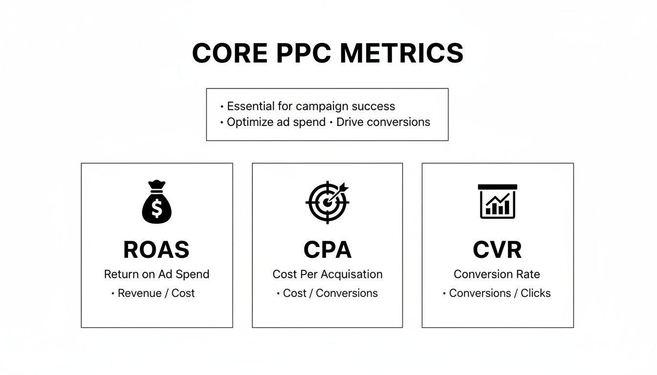
This kind of visual snapshot immediately shows the health of your campaigns by focusing on what really matters: profitability, efficiency, and effectiveness.
Making Your Visuals Pop with Purpose
Great visuals aren't just about making things look pretty. Every color, label, and annotation should guide the viewer’s eye to the most important takeaways. It’s about being intentional.
For instance, you could use your brand's primary color for most of the data but a bright, contrasting color to highlight a sudden drop in clicks. Then, add a small note right on the chart: "Competitor B launched a flash sale this week." That one simple addition shows you're not just reporting numbers; you're analyzing what's happening behind them. It builds a ton of trust.
Your goal isn't to build a beautiful but confusing dashboard. It's to build one that's so intuitive the insights are impossible to miss. Your visuals should answer questions, not create more of them.
Ultimately, you want to design a report that people actually look forward to seeing. By picking the right charts and adding that extra layer of context, you make it easy for everyone to see the wins, understand the challenges, and feel confident in where you're steering the ship.
Automating Your Reporting to Save Time
Are you still manually pulling data and pasting it into spreadsheets every single week? If so, you're not just doing tedious work—you're burning valuable hours that should be spent on strategy. Let's get you set up with an automated reporting workflow that delivers insights without the soul-crushing admin.
Automating your PPC report isn't about cutting corners; it's about reclaiming your time. It frees you up to actually analyze what the numbers are telling you and make smart, strategic moves instead of just compiling data.

The screenshot above from Looker Studio is a perfect example of what's possible. It’s a clean, dynamic dashboard pulling from multiple data sources. The goal is to build a report that updates itself and tells a clear story, with zero manual effort from you after the initial setup.
Building Your Automated Dashboard
First things first, you need to pick the right tool for the job. You don't need a super complex or expensive setup to make this happen. There are plenty of powerful options out there that can pull all your data sources into one reliable dashboard.
Here are a few of my go-to choices:
- Looker Studio: It’s completely free, plays nicely with all the Google products (Ads, Analytics, you name it), and is surprisingly versatile for building custom, interactive reports.
- Supermetrics: This is an absolute beast of a data connector. It pulls info from pretty much any marketing platform you can think of—Facebook Ads, LinkedIn Ads, etc.—and pipes it straight into Looker Studio, Google Sheets, or Excel.
- AgencyAnalytics: A fantastic all-in-one solution if you're an agency. It's built for managing reports across multiple clients and even includes white-labeling.
Once you’ve picked your platform, you'll need to connect your data sources. This just means giving the tool permission to pull data directly from Google Ads, Google Analytics, Microsoft Ads, and any other ad platforms you’re running. This connection is the magic that allows your dashboard to refresh automatically with the latest performance data.
Automating reports isn't about being lazy; it's about being efficient. Your brain is your most valuable asset—use it for strategy and analysis, not for copy-pasting numbers into a template.
Setting Up Scheduled Delivery
The final piece of the automation puzzle is getting the report into the right hands at the right time. Thankfully, most reporting tools let you schedule automated email delivery.
You can set it up to send a PDF of the high-level dashboard to your CEO every Monday morning, and a more granular version to your marketing team on the first of every month. This simple step ensures stakeholders get consistent updates without you having to remember to hit "send." It keeps everyone in the loop and shows you’re on top of things.
If you’re still deep in the world of spreadsheets, it’s worth learning how to automate Excel reports—it can save a ton of time and make your numbers more trustworthy. And if you need some inspiration for what your automated reports could look like, check out our library of ready-to-use PPC reporting templates.
Answering the Tough PPC Reporting Questions
Even with the best templates in the world, you're going to get hit with tough questions. A killer PPC report doesn't just show the numbers; it anticipates the "why" and answers it before it's even asked.
Let's dive into a couple of the most common curveballs marketers face. Getting these right will make you look like the expert you are and build incredible trust with your clients or boss.
How Do I Choose the Right Attribution Model?
This is a big one, and it comes up all the time. The attribution model you pick—whether it's Last Click, First Click, or Data-Driven—changes the entire story your data tells.
Think of it this way: Last Click is like giving all the credit to the cashier who rang up the sale, ignoring the window display, the friendly sales associate, and the TV ad that got the customer in the store. It’s simple, but it rarely reflects reality.
I almost always recommend moving to a multi-touch model. A Position-Based model, for example, gives credit to both the first and last ads a user saw, while also distributing some credit to the touchpoints in between. It acknowledges that the customer journey isn't a straight line. The right model really depends on your business and sales cycle, but stepping away from Last Click is a solid first move.
Your goal isn't just to count conversions. It's to understand the full story of how someone decided to buy. Your attribution model needs to be sophisticated enough to tell that story accurately.
What’s the Best Way to Explain a Performance Dip?
Sooner or later, it happens. A campaign that was crushing it suddenly takes a nosedive, and you’ve got a stakeholder wanting to know what’s going on. The absolute worst thing you can do is hide.
Get out in front of it. Be direct, be honest, and show you have a plan.
Here's how I've always handled it in my reports:
- Own It: Start by clearly stating what happened. "This week, our lead conversion rate dropped by 15%." No sugarcoating.
- Present Your Theory: Give your expert opinion on the cause. "We believe this is tied to a new competitor campaign that launched on Monday, which has driven up average CPCs across our top keywords."
- Show Your Plan: This is the most important part. Detail exactly what you're doing about it. "In response, we are reallocating budget to our long-tail campaigns and launching a new ad creative that highlights our unique free shipping offer."
This simple three-step response turns a potential disaster into a moment of strategic leadership. You're not just reporting a problem; you're actively solving it.
For those deep in the weeds of e-commerce, especially on Amazon, presenting data efficiently is its own art form. If you're looking for platform-specific tips, this guide on Amazon Advertising Reporting is a fantastic resource for streamlining how you analyze and present your campaign data.
When you tackle these tough questions head-on, your PPC report stops being a simple look at the past. It becomes a strategic tool that builds confidence, educates your audience, and proves the immense value you bring to the table.
Ready to stop wasting time on manual keyword cleanup and start building more profitable campaigns? Keywordme integrates directly into your Google Ads workflow, allowing you to find negative keywords, expand ad groups, and apply match types up to 10x faster. Try it free for seven days and see the difference at https://www.keywordme.io.