10 Google Analytics Report Templates to Steal for 2026
10 Google Analytics Report Templates to Steal for 2026

Meta title: Google Analytics Report Templates for 2026
Meta description: Google analytics report templates for agencies, execs, and PPC teams. Compare 10 practical options and map GA4 metrics to ad actions fast.
Teams often hit the same wall with google analytics report templates. GA4 is live, the data is there, clients want answers, and nobody wants to rebuild the same dashboard every Monday from scratch.
That’s exactly why templates matter more now than they did in the Universal Analytics era. GA4 adoption surged after UA support ended on July 1, 2023, and Semrush notes that GA4 templates commonly track more than 20 core KPIs across sessions, goals, devices, geography, and demographics in one repeatable setup through GA4 report template examples from Semrush. If you manage reporting for a brand, a few clients, or a messy paid media account, that repeatability is the difference between insight and spreadsheet debt.
The bigger shift is practical, not academic. Templates now handle the boring part. They pull daily, weekly, or monthly updates, standardize naming, and keep everyone looking at the same numbers instead of arguing over which export is “right.” If you already have a broader reporting stack, this guide to WeekBlast analytics is also worth a read.
The catch is that not all templates solve the same job. Some are perfect for agency client reports. Some are built for executive summaries where one page has to do all the work. Others are better for PPC deep dives, where value comes from connecting GA4 behavior data to campaign changes inside Keywordme.
That’s the angle here. Not just a list of templates, but a shortlist based on what you need to ship.
1. Looker Studio Report Gallery (official Google)
If you want the broadest starting point, use the Looker Studio Report Gallery. It’s still the easiest place to grab a GA4 template, make a copy, connect your property, and get moving in a few minutes.
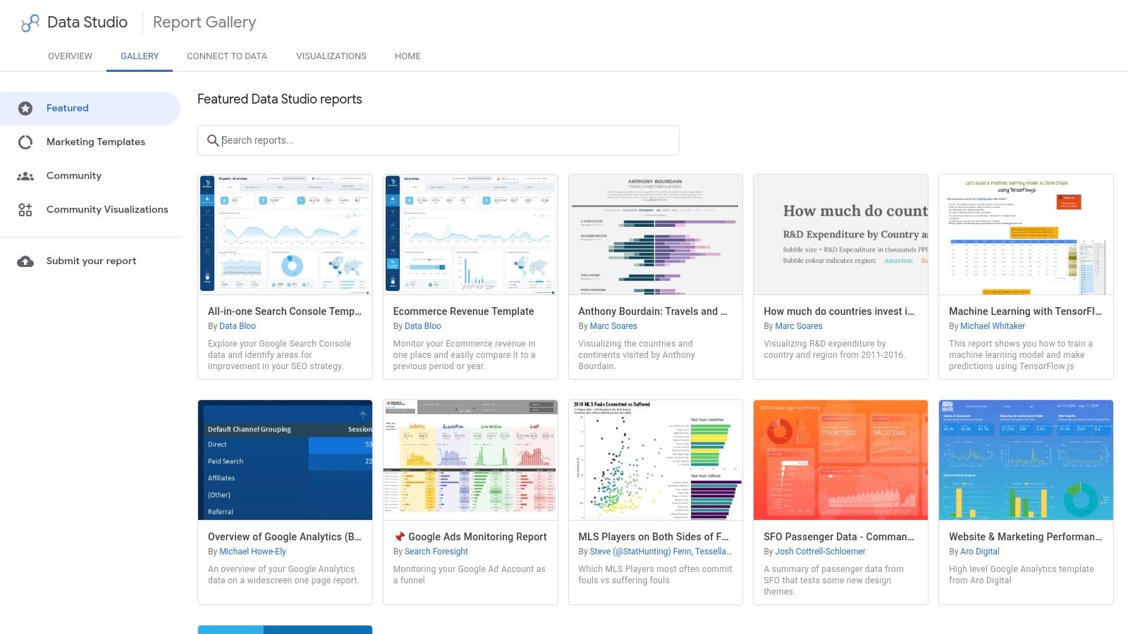
The strength here is range. You’ll find simple traffic overviews, acquisition layouts, ecommerce reporting, and blended dashboards that pull in Google Ads or Search Console when the template builder has set that up well. For a solo marketer or in-house analyst, that “Make a copy” flow is hard to beat.
Best job to be done
This is the best first stop if you need a flexible base template and you’re comfortable editing visuals yourself. It works well for:
- In-house reporting: Start with a clean GA4 shell and customize only what leadership reads.
- Client onboarding: Duplicate a starter report for each new account instead of rebuilding pages from zero.
- Search visibility reviews: Pair GA4 with Search Console when you’re tracing content performance and hidden query gaps, especially alongside this piece on analytics not provided keywords.
The trade-off is quality control. Some gallery templates are sharp and practical. Some are cluttered, rely on paid connectors, or bury the useful widgets under too many charts.
Practical rule: If a template needs major surgery before week one is over, it wasn’t a good template. It was just a mockup.
I like the official gallery most when speed matters more than polish. It’s free, easy to copy, and close enough to universal that many teams can adopt it quickly. I like it less when an agency needs strict consistency across a large client roster, because author quality varies and maintenance becomes your problem.
2. Supermetrics – GA4 Template Gallery (Looker Studio)
Supermetrics’ GA4 template gallery fits agencies better than most free-first options. The reason is simple. The templates are built with connector-heavy reporting in mind, so mixing GA4 with Google Ads and other channels feels like the default rather than an afterthought.
If your reporting stack already runs through Supermetrics, these templates save real setup time. They’re usually structured around actual marketing questions, not just “here are all the charts GA4 can show.”
Where it works best
This is the best pick when you’re managing cross-channel reporting and don’t want connector issues eating half your reporting day. It’s especially useful for:
- Multi-source client decks: Blend GA4 with ad and social data in one place.
- Agency refresh cycles: Scheduled refreshes and stable connectors matter when reports are client-facing.
- Organic and paid overlap reviews: The acquisition views work well when paired with a clearer understanding of Google Analytics organic search.
The downside is cost. Supermetrics isn’t the tool I recommend when someone only needs a lightweight GA4 dashboard for one property. You’re paying for connector depth, reliability, and scale. If you don’t need that, the spend is hard to justify.
There’s also a subtle workflow issue. Teams sometimes overbuild because the connector layer makes it easy to add everything. That usually leads to reports full of channels, dimensions, and filters that nobody checks.
The best Supermetrics setup is usually narrower than people expect. Fewer pages, tighter KPIs, cleaner ownership.
For agencies with a messy data mix, though, this is one of the most dependable template ecosystems around. It’s less “starter pack” and more “production reporting.”
3. Databox – GA4 Dashboard & Report Templates
Monday morning, the CEO wants one screen that answers three questions: Are we growing, which channels are driving conversions, and where did performance slip last week? That’s the job Databox handles well. Databox’s GA4 dashboards are built for teams that need a report to look client-ready or exec-ready without spending hours arranging charts.
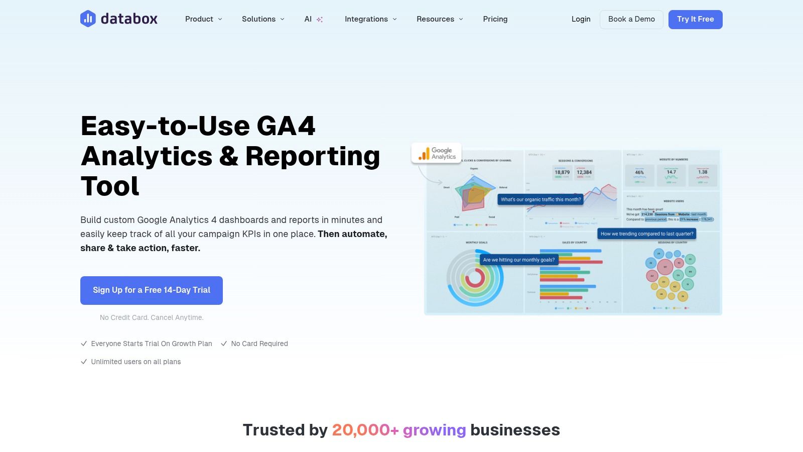
What stands out is presentation discipline. Databox templates usually start with headline KPIs, trend lines, and clear comparisons, which makes them a better fit for executive summaries than analyst workspaces. I use tools like this when the reporting job is distribution and alignment, not raw analysis.
That distinction matters.
For the jobs-to-be-done angle, Databox fits best in two buckets:
- Executive summary reports: Weekly or monthly readouts for leadership who want fast signal, not full GA4 exploration.
- Agency client reporting: Cleaner presentation, scheduled delivery, and mobile access help when reports need to survive outside the analytics team.
It can also support PPC reporting, but with a caveat. Databox is strongest when your paid media report is KPI-led. Spend, sessions, conversion rate, CAC, ROAS, and assisted conversions. If the PPC team needs granular query analysis, custom joins, or channel-by-channel diagnostic work, I’d treat Databox as the summary layer and keep the heavier analysis elsewhere.
A practical way to use it is KPI mapping. Tie GA4 metrics to the decisions your ad team makes. Sessions from paid traffic help spot landing page friction. Engaged sessions and engagement rate show whether clicks are qualified. Conversions and purchase revenue connect campaign traffic to business outcomes. If your team also reviews search intent and keyword-level opportunity outside GA4, these dashboards pair well with customizable SEO dashboards for cross-channel reporting and keyword research workflows in tools like Keywordme.
The trade-off is flexibility. Databox templates live inside Databox, so you get speed and consistency, but less freedom than a fully custom Looker Studio build. That’s usually fine for leadership reporting. It gets limiting fast for analysts who want custom chart logic, unusual dimensions, or tightly controlled blended views.
Used well, Databox keeps teams from overbuilding. It gives stakeholders a reporting surface they’ll check, and that alone solves a real problem for busy marketing teams.
4. Porter Metrics – Free GA4 Looker Studio Templates
A common reporting problem looks like this. The PPC manager wants to know whether paid traffic is converting. The client wants a clean weekly update. The analyst wants to avoid rebuilding the same GA4 report for every account. Porter Metrics templates fit that middle ground well.
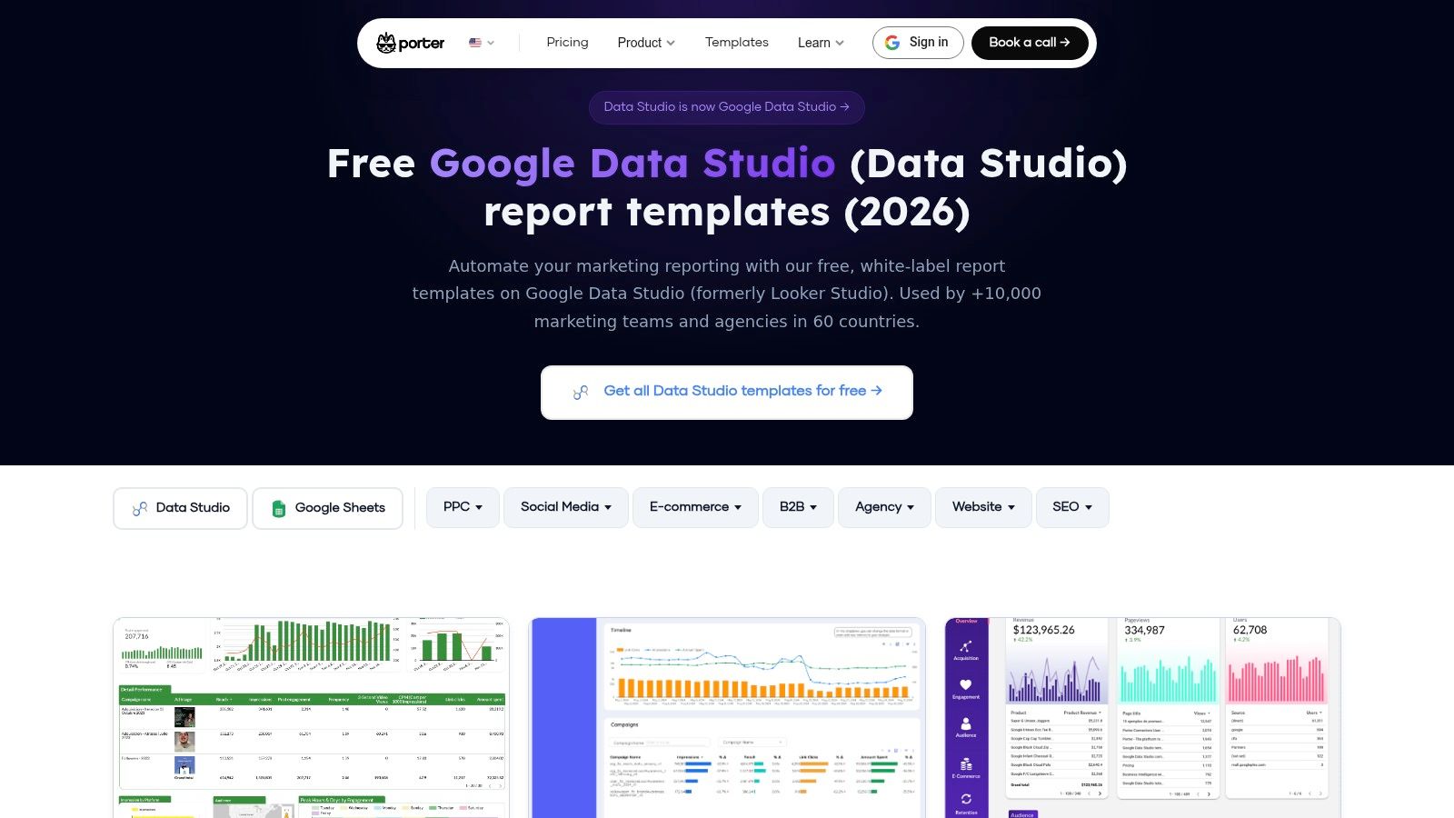
What I like about Porter is the job-to-be-done fit. These templates are built for recurring marketing reports, especially agency delivery and paid media reviews, not one-off dashboard experiments that look polished but break the moment a stakeholder asks for a segmented view.
That matters in practice. A free GA4 template is only useful if the structure holds up after week three, when someone asks for campaign filters, landing page performance, branded vs non-branded traffic, or a cleaner executive summary tab. Porter’s layouts usually start closer to that reality than generic gallery templates.
Strong for PPC reporting that still needs GA4 context
Porter works best for teams that need more than a traffic summary but less than a full custom analytics stack. For PPC reporting, that usually means mapping GA4 metrics to campaign decisions instead of dumping raw acquisition data into a dashboard.
A solid setup might look like this:
- Sessions from paid traffic to check whether clicks are reaching the right pages
- Engaged sessions and engagement rate to judge traffic quality after the click
- Conversions and purchase revenue to connect campaigns to outcomes that matter
- Landing page views and bounce-related engagement signals to catch message mismatch
- Channel or campaign filters to separate branded search, prospecting, and retargeting
This KPI mapping is where Porter earns its keep. It gives PPC teams a usable reporting shell for the questions they ask every week. Which campaigns drive qualified traffic? Which landing pages waste paid clicks? Where do GA4 conversion paths support what the ad platform is reporting? If your team also reviews keyword intent and search term opportunities outside GA4, this kind of report pairs well with tools like Keywordme for the campaign planning side.
The trade-off is flexibility. Porter’s free templates are useful on their own, but the smoother workflow usually comes from using Porter’s own connectors and report setup. That saves time, especially for agencies standardizing reports across many clients, but it also means the experience is more opinionated than a fully custom Looker Studio build.
- Good fit: Agencies and PPC teams that want repeatable GA4 plus paid media reporting
- Less ideal: Analysts who need warehouse-level modeling, custom joins, or advanced attribution logic
- Best use: Standardized account reports with clear KPI mapping from GA4 metrics to campaign actions
Used well, Porter gives teams a practical template library by reporting job, not just by chart style. That makes it easier to choose the right report for an executive summary, a client-facing update, or a PPC performance review without starting from scratch each time.
5. DashThis – GA4 Report Template
A common agency problem looks like this. The numbers are ready, but the account team still has to turn them into something a client will read. That last mile, branding, layout, scheduled delivery, and keeping every monthly report consistent, is the part DashThis handles well.
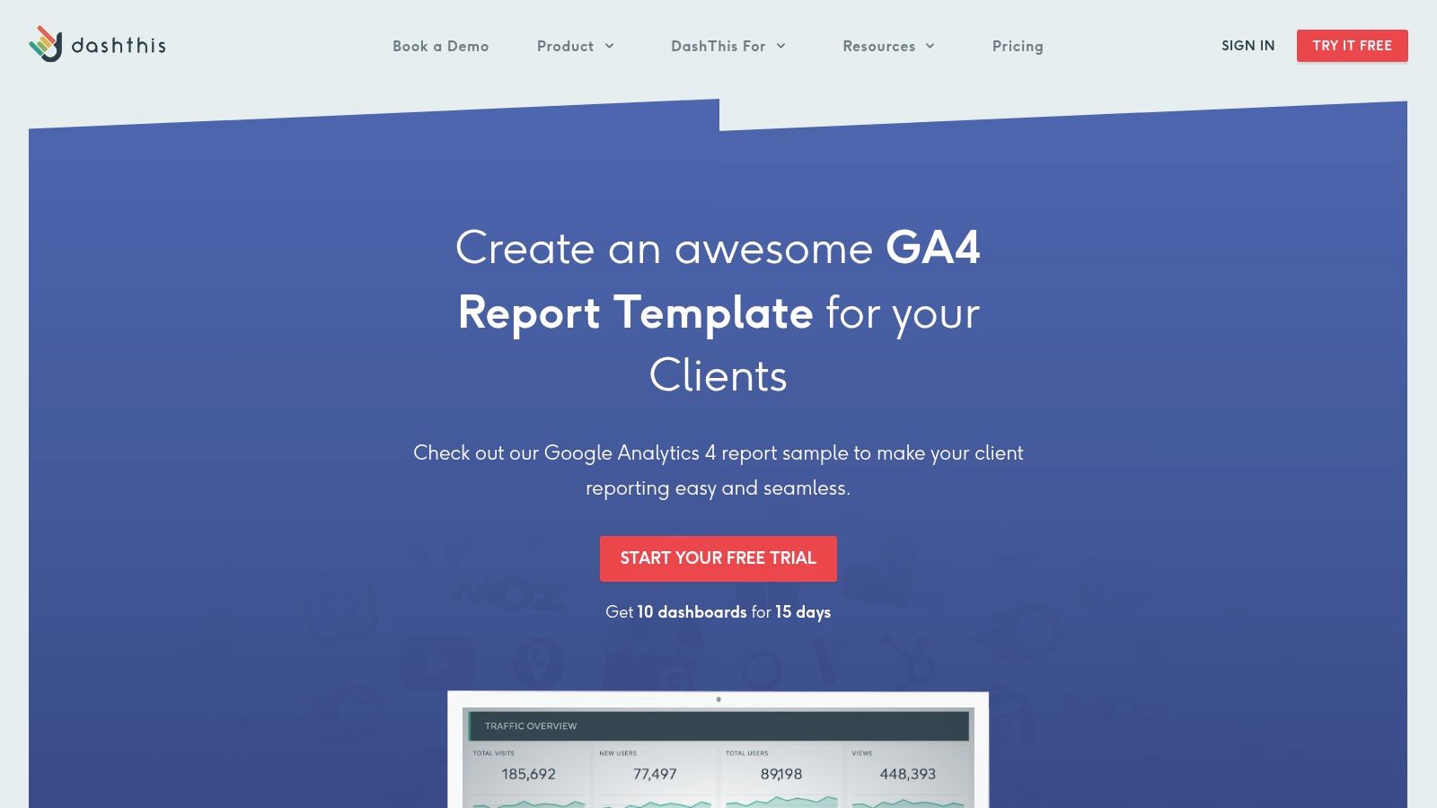
DashThis fits a specific job-to-be-done: client-facing GA4 reporting for teams that need reports to look polished without rebuilding the same deck every month. The white-label options are strong, scheduled send-outs are straightforward, and the dashboard format works well for agencies that want a report clients can scan without a walkthrough call.
That focus shapes the trade-off. DashThis is better as a delivery system than an analysis workspace. I’d pick it for recurring client updates, executive summaries, or cross-channel monthly reporting where readability matters as much as metric depth. I would not pick it for PPC investigation sessions where the team needs custom GA4 exploration, complex data blending, or warehouse-level logic.
For PPC teams, the useful question is whether DashThis helps connect GA4 metrics to ad decisions. It can, within limits. A practical setup is to map sessions, engaged sessions, key events, landing page conversion rates, and revenue to campaign groups so account managers can spot where paid traffic quality drops after the click. If your workflow also includes keyword research and search term planning outside GA4, that reporting layer pairs well with tools like Keywordme, while DashThis handles the client-ready presentation.
- Strong for: White-label client reports, scheduled delivery, executive summaries, and mixed-source marketing dashboards
- Less ideal for: Analysts who need custom visual logic, advanced attribution work, or highly flexible PPC analysis
- Best use: Agencies that want a repeatable GA4 reporting process with branded output and less manual formatting
- Watch for: Dashboard limits and pricing pressure as client volume grows
If your bottleneck is report production, not data collection, DashThis solves a real operational problem. It saves time where agencies usually lose it: packaging the same performance story clearly, on schedule, and in a format clients recognize right away.
6. AgencyAnalytics – GA4 Reporting Templates
Monday morning, three account managers are asking for client reports, one PPC lead wants a cleaner read on post-click conversions, and someone still needs permissions fixed on two dashboards. AgencyAnalytics fits that kind of workload well because it was built for repeatable agency operations, not just one polished report.
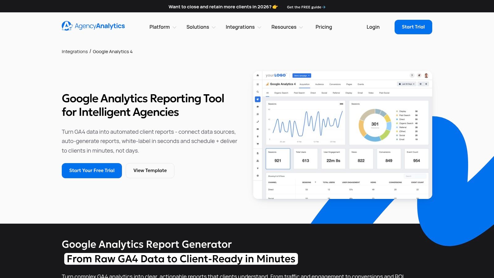
The appeal is not just the GA4 template itself. It is the system around it. Bulk rollouts, drag-and-drop edits, scheduled delivery, permissions, and multi-channel reporting save time in the places agencies usually lose it. If your team reports on GA4 alongside Google Ads, SEO, call tracking, and social, that operational layer matters more than having the most customizable chart canvas.
Best for multi-client reporting at scale
AgencyAnalytics is a strong fit for agencies that organize reporting by job-to-be-done. One template structure for executive summaries. Another for account managers who need monthly client updates. A more detailed version for PPC specialists reviewing traffic quality, conversion paths, and landing page performance. That setup is easier to maintain when templates, users, and delivery schedules live in one platform.
I like it most for agencies that have already outgrown ad hoc dashboard duplication. Once naming conventions, permissions, and report scheduling start eating real hours each month, the software earns its keep.
For PPC teams, the useful test is KPI mapping. Can the template connect GA4 metrics to campaign decisions? Usually yes, if you set it up with intent. A practical reporting layer might map sessions, engaged sessions, key events, session conversion rate, revenue, and landing page performance to campaign groups or service lines. That helps account teams answer the questions clients ask: which campaigns drive qualified visits, where traffic drops off after the click, and which landing pages hurt conversion efficiency. If your workflow also includes search term planning or keyword expansion outside GA4, that analysis pairs well with tools like Keywordme, while AgencyAnalytics handles the client-facing report.
There are trade-offs. AgencyAnalytics is less attractive for a small team that only needs one or two dashboards. The platform also sits outside Looker Studio, so teams that want full control over custom visual logic may feel boxed in faster than they would in a native reporting build.
Field note: The best agency template is the one a junior analyst can duplicate, QA, and send without guessing what a metric means.
For agencies with a growing client roster, that practicality matters. AgencyAnalytics helps standardize reporting without forcing every account into the exact same story, which is usually the balance agencies are trying to get right.
7. Power My Analytics (PMA) – GA4 Looker Studio Template
A common reporting problem looks like this. The team wants to stay in Looker Studio, but the native setup keeps turning into connector fixes, field checks, and one more round of cleanup before the dashboard is client-ready. Power My Analytics works well in that middle tier.
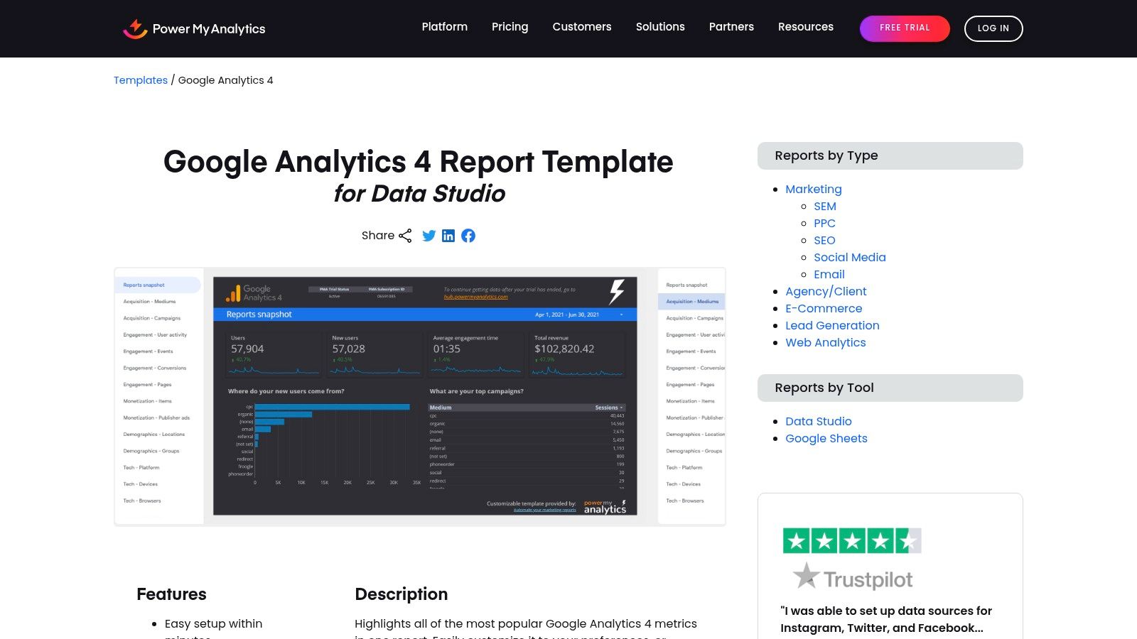
What I like about PMA is the job it does. It is not trying to replace your reporting stack. It gives analysts a usable GA4 Looker Studio template, setup help, and connector support in one package. For in-house teams and smaller agencies, that usually means less time spent fixing the plumbing.
The template structure is sensible. You get the sections teams review in recurring reports: overview, acquisition, engagement, and monetization. That matters more than flashy charts. A report that follows the way stakeholders ask questions is faster to QA, easier to duplicate, and easier to adapt for different jobs-to-be-done, whether that is a client-facing monthly report, an executive summary, or a PPC performance review.
Best for teams that want Looker Studio control without a messy setup
PMA earns its spot because it helps with the part many template roundups gloss over. Setup. If your data sources are spread across ad platforms and GA4, connector reliability matters almost as much as the dashboard design.
For PPC teams, I would judge this template on KPI mapping, not appearance. Can you connect GA4 metrics to ad decisions without rebuilding half the report? Usually yes. Sessions, engaged sessions, key events, conversion rate, revenue, and landing page performance can all be mapped into campaign analysis views that make sense for paid media reviews. Pair that with search term work or keyword expansion in tools like Keywordme, and PMA can serve as the reporting layer that turns post-click GA4 data into budget and landing page decisions.
There are limits. PMA is a better fit for reporting clarity than advanced modeling. If your team needs heavy custom attribution logic, blended datasets across many sources, or highly opinionated executive dashboards, you may outgrow the template and end up building more from scratch.
- Use it for: GA4 reporting in Looker Studio when setup speed and connector support matter.
- Skip it if: Your workflow depends on advanced custom modeling or highly customized visual logic.
- Nice bonus: The onboarding and template variants reduce setup friction for analysts who do not want to troubleshoot every field manually.
PMA is a practical choice for teams that want a right-sized GA4 template. You keep the familiarity of Looker Studio, but with less setup drag than a fully DIY approach.
8. Catchr – Free GA4 Looker Studio Template
Catchr’s free GA4 template is the kind of template I’d hand to a team that needs a clean dashboard today, not after a long implementation cycle. It’s straightforward, visually tidy, and easy to duplicate.
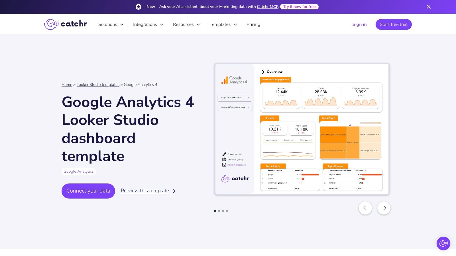
That simplicity is the point. Catchr doesn’t try to be your whole reporting stack. It gives you a fast starting layer.
Good starter, limited ceiling
I like Catchr for quick internal reviews, small business setups, and early-stage reporting where the team mostly needs traffic and engagement essentials in one place. It works with the native GA4 connector and can extend further if you use Catchr connectors later.
What it doesn’t do out of the box is deep analysis. If your team needs custom channel stitching, more advanced attribution views, or a polished client service workflow, you’ll probably outgrow it.
Keep a starter template simple on purpose. The first dashboard should answer obvious questions fast, not try to solve every reporting problem at once.
That’s why Catchr is useful. It respects the difference between “need a dashboard” and “need a reporting system.” Many teams confuse those and end up overengineering the first version.
9. DashboardDr – Free GA4 Looker Studio Templates (Responsive)
DashboardDr’s responsive GA4 templates stand out for one practical reason. They’re designed to share well across devices.
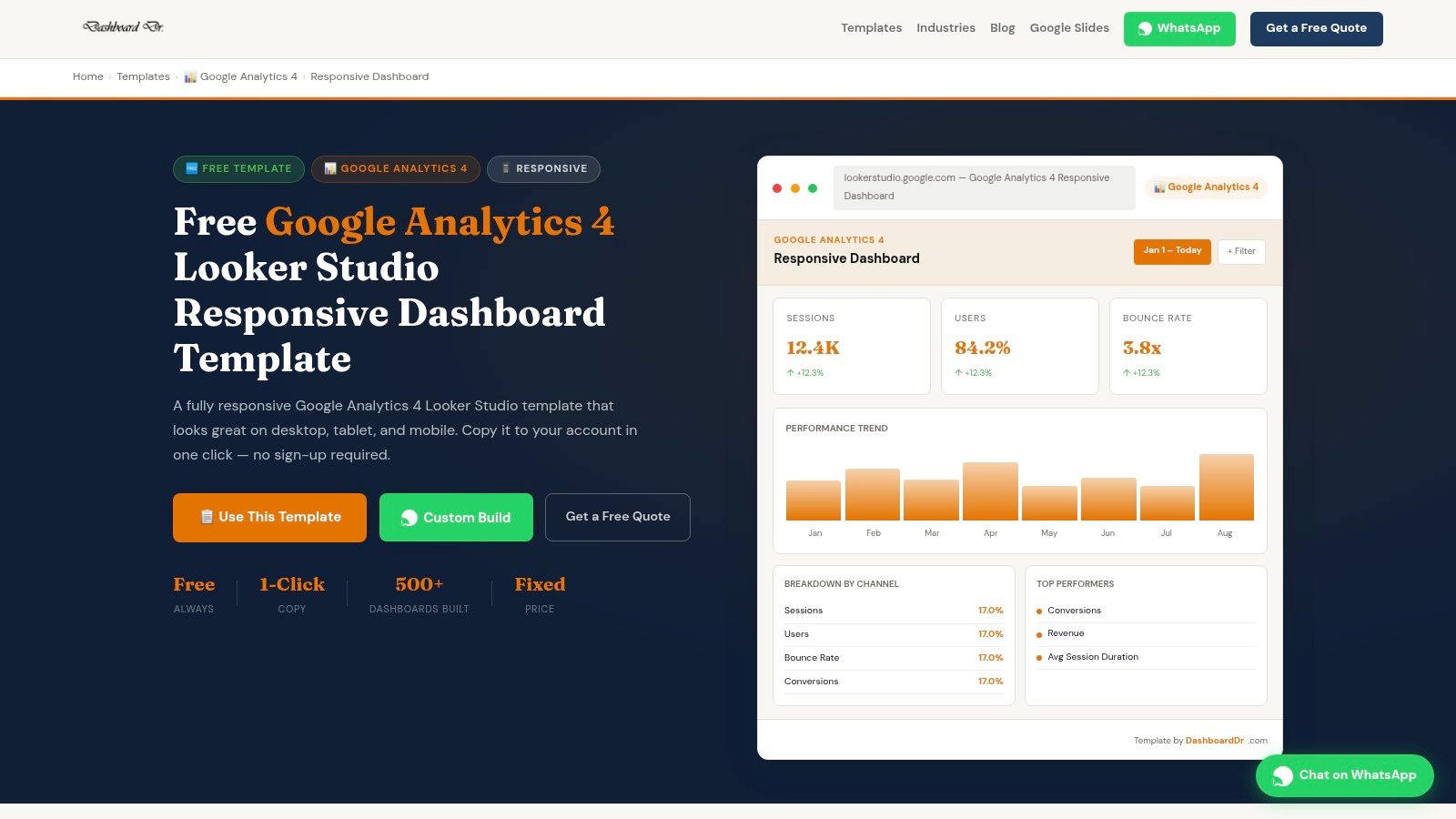
That sounds small until a client opens your report on a laptop, a phone, and a cramped shared screen in the same week. Plenty of Looker Studio templates still fall apart outside the monitor they were built on.
Where it earns its keep
DashboardDr is a strong fit for executive snapshots, top-line monthly reviews, and basic traffic or acquisition reporting where readability matters more than depth. If someone wants a clean pulse check without poking into every dimension, this style works well.
- Best for: Leadership snapshots, simple client rollups, mobile-friendly sharing.
- Not best for: Heavy optimization workflows or reports that need lots of drilling and slicing.
- Why it matters: A report people can open and understand beats a complex one they avoid.
The vendor ecosystem is smaller than bigger names in this list, so you won’t get the same community footprint or connector gravity. But if your main issue is presentation and portability, DashboardDr solves a very real problem that a lot of “feature-rich” tools ignore.
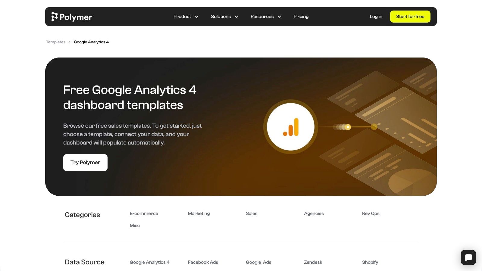
10. Polymer – Free GA4 Dashboard Templates
Polymer’s GA4 templates are better for exploration than formal reporting. If you’re trying to quickly inspect landing pages, engagement patterns, or traffic slices without building a full dashboard framework, Polymer can be a handy shortcut.
The interface is different from Looker Studio, and that’s either a plus or a minus depending on your team. For internal analysis, it can feel refreshingly fast. For agency delivery, it may feel less standardized.
Better for internal reviews than client decks
Polymer is useful when the goal is to explore questions, not to formalize a recurring reporting process. Landing page checks, traffic filtering, and engagement-focused reviews make sense here.
I wouldn’t make it my primary agency reporting platform unless the team already prefers the Polymer experience. White-labeling and standardized client delivery aren’t really the core strength.
This is one of those tools that works best when you know exactly why you’re using it. Exploratory analysis, yes. Full reporting operating system, probably not.
Top 10 GA4 Report Templates Comparison
| Solution | Core features & integrations | UX & Quality (★) | Price/Value (💰) | Target Audience (👥) | Unique Selling Point (✨) |
|---|---|---|---|---|---|
| Looker Studio Report Gallery (official Google) | Curated GA4 templates; mix GA4 + Ads + BigQuery | ★★★ | 💰 Free to use | 👥 Marketers & analysts | ✨ Official, one-click copy & broad community |
| Supermetrics – GA4 Template Gallery | Multi-source templates built for connectors (GA4 + Ads + social) | ★★★★★ 🏆 | 💰 Paid (connector required for many uses) | 👥 Agencies & multi-channel teams | ✨ Reliable connectors + scheduled refreshes |
| Databox – GA4 Dashboard & Report Templates | KPI library, mobile app, alerts, GA4+Ads blending | ★★★★ | 💰 Freemium → paid tiers | 👥 Client-facing teams & agencies | ✨ Fast, client-ready dashboards & alerts |
| Porter Metrics – Free GA4 Looker Studio Templates | Free templates + optional Porter connectors for blends | ★★★★ | 💰 Free templates; paid connectors available | 👥 PPC agencies & SMBs | ✨ Lots of free copies + simple docs |
| DashThis – GA4 Report Template | White-label, automated delivery, multi-source blending | ★★★★ | 💰 Paid platform (white-label) | 👥 Agencies needing automated client reports | ✨ Automated, white‑label client reporting |
| AgencyAnalytics – GA4 Reporting Templates | Drag-drop editor, cross-channel dashboards, bulk apply | ★★★★ | 💰 Paid (scales per client) | 👥 Agencies at scale | ✨ Agency-first workflow & templating tools |
| Power My Analytics (PMA) – GA4 Template | GA4 overview pages, PMA hub setup, budget connectors | ★★★ | 💰 Affordable connector subscription | 👥 Cost-conscious teams & consultants | ✨ Lower-cost connector alternative |
| Catchr – Free GA4 Looker Studio Template | Clean starter dashboard; native or Catchr connectors | ★★★ | 💰 Free starter template | 👥 Beginners & quick-start analysts | ✨ Copy-and-go simplicity |
| DashboardDr – Free GA4 Looker Studio Templates (Responsive) | Responsive KPI & acquisition templates, multiple variants | ★★★ | 💰 Free to copy | 👥 Execs & small agencies | ✨ Responsive, device-friendly layouts |
| Polymer – Free GA4 Dashboard Templates | Landing page & engagement focused pages; shareable | ★★★ | 💰 Free templates | 👥 Internal teams & explorers | ✨ Quick experimentation templates |
Final Thoughts
Monday morning, the client asks why spend went up and lead quality went down. A prettier GA4 dashboard does not answer that question. The useful template is the one that helps the team decide what to change next.
That is the best way to choose google analytics report templates. Match the report to the job.
Agency teams usually need scheduled, white-label reporting with clean rollups across channels. Executive stakeholders need a short summary that shows trend direction, outliers, and budget efficiency without twenty supporting charts. PPC managers need a closer look at landing pages, search intent, device splits, and conversion quality because those views lead to bid changes, negative keywords, ad group cleanup, and page tests.
That job-to-be-done lens matters more than template count.
The other mistake I see is treating reporting as the finish line. A template can surface weak engagement, low-converting traffic, or channel mismatch. It cannot decide whether the next action should be a landing page fix, a search term exclusion, a geo bid adjustment, or a tighter match type strategy. PPC teams still need a KPI map that connects GA4 behavior to campaign actions.
KPI mapping for PPC teams
A simple mapping framework works well in practice:
- Engagement rate by landing page: Low engagement on paid landing pages usually points to message mismatch, weak page intent, or poor audience targeting. Start by checking search terms and ad copy alignment before changing bids.
- Session quality by device: If mobile traffic drives visits but not meaningful engagement or conversions, review page speed, form friction, and mobile ad-to-page continuity.
- Conversion rate by channel and campaign: Strong traffic volume with weak conversion rate often means the campaign is buying the wrong click. Tighten match types, add negatives, or split broad ad groups into clearer themes.
- Geography and audience segments: Good performance in a few segments often justifies budget reallocation faster than account-wide bid edits.
- Organic versus paid landing page behavior: Pages that work for organic traffic can reveal intent patterns, content structure, and offers that paid campaigns should borrow.
I use templates for pattern detection first, presentation second. That is why connector-heavy options help teams that need blended reporting, while agency-focused platforms earn their keep on workflow and delivery. Free Looker Studio templates are still fine for many teams. They just ask for more cleanup, more QA, and more analyst time.
The discussion of the GA4-to-PPC workflow gap gets this right. Reporting usually explains what happened. Performance gains come from shortening the distance between insight and account change.
So the practical close is simple. Pick the template that fits the reporting job. Then pressure-test whether the KPIs in that report lead to real actions for the team using it. If they do not, the template is only decoration.
If your GA4 templates help you spot wasted spend but the cleanup still happens by hand, Keywordme is the missing layer. It turns search term insights into real Google Ads actions faster, from negative keyword builds to match type cleanup and ad group expansion, so your reporting directly changes campaigns instead of just documenting them.