Making Sense of Pay Per Click Reports: A Practical Guide
Making Sense of Pay Per Click Reports: A Practical Guide

Pay-per-click reports are your campaign's health check. They cut through all the noise and show you exactly what’s working, what's a total flop, and where every single cent of your ad budget is going. If you're running ads without them, you're basically flying blind and just hoping for the best.
Why Pay Per Click Reports Are Your Campaign's Secret Weapon

Think of a PPC report as part receipt, part report card. The receipt part meticulously tracks every dollar you spend. The report card side gives you a grade, showing the real results—like leads, sales, and traffic—that your investment actually produced. It's a simple idea, but it's the core of reporting: connecting what you spend to what you get.
This connection isn't just a "nice-to-have" feature; it's the bedrock of any solid paid search strategy. You wouldn't run a business without keeping an eye on your finances, right? So why on earth would you run an ad campaign without tracking its performance?
Turning Data into Decisions
The real magic of a good report is how it turns a mountain of raw data into clear, actionable insights. It’s not about staring at a spreadsheet full of numbers; it's about understanding the story those numbers are telling you. With a solid report, you can:
- Justify Your Ad Spend: Show stakeholders exactly what their money is achieving. Budget conversations suddenly get a whole lot easier.
- Spot Performance Trends: See what’s killing it so you can double down on your winners, and spot the duds before they burn through your cash.
- Make Smarter Choices: Stop guessing. Base your next move—from keyword tweaks to landing page redesigns—on hard evidence.
This whole process is what separates the pros from the amateurs. To really get the most out of these reports, you have to embrace data-driven decision-making; it's the key that unlocks real growth.
The Financial Stakes of PPC Reporting
The need for accurate reporting gets even clearer when you look at the money involved. The global search advertising market is huge—we're talking a projected $351.5 billion in worldwide paid search spending. That’s a staggering amount of money businesses are pouring in to get noticed.
And it's not slowing down. That figure is expected to jump to $483.55 billion by 2029, which tells you just how crowded this space is becoming. For us marketers, it means every click matters, and cutting out wasted spend isn’t just a good idea—it’s a matter of survival if you want to maintain a positive ROI.
A great report doesn't just show you data; it gives you context. It answers the all-important "so what?" question, turning a boring data dump into a strategic roadmap for what to do next.
Without this level of insight, you're just another company throwing money into the digital void with no real idea of what's coming back. Properly analyzing your performance with detailed pay per click reports is the first step in making every dollar work harder for you. This relentless focus on performance is a central theme in our guide to paid search analytics.
Decoding the Metrics That Actually Matter
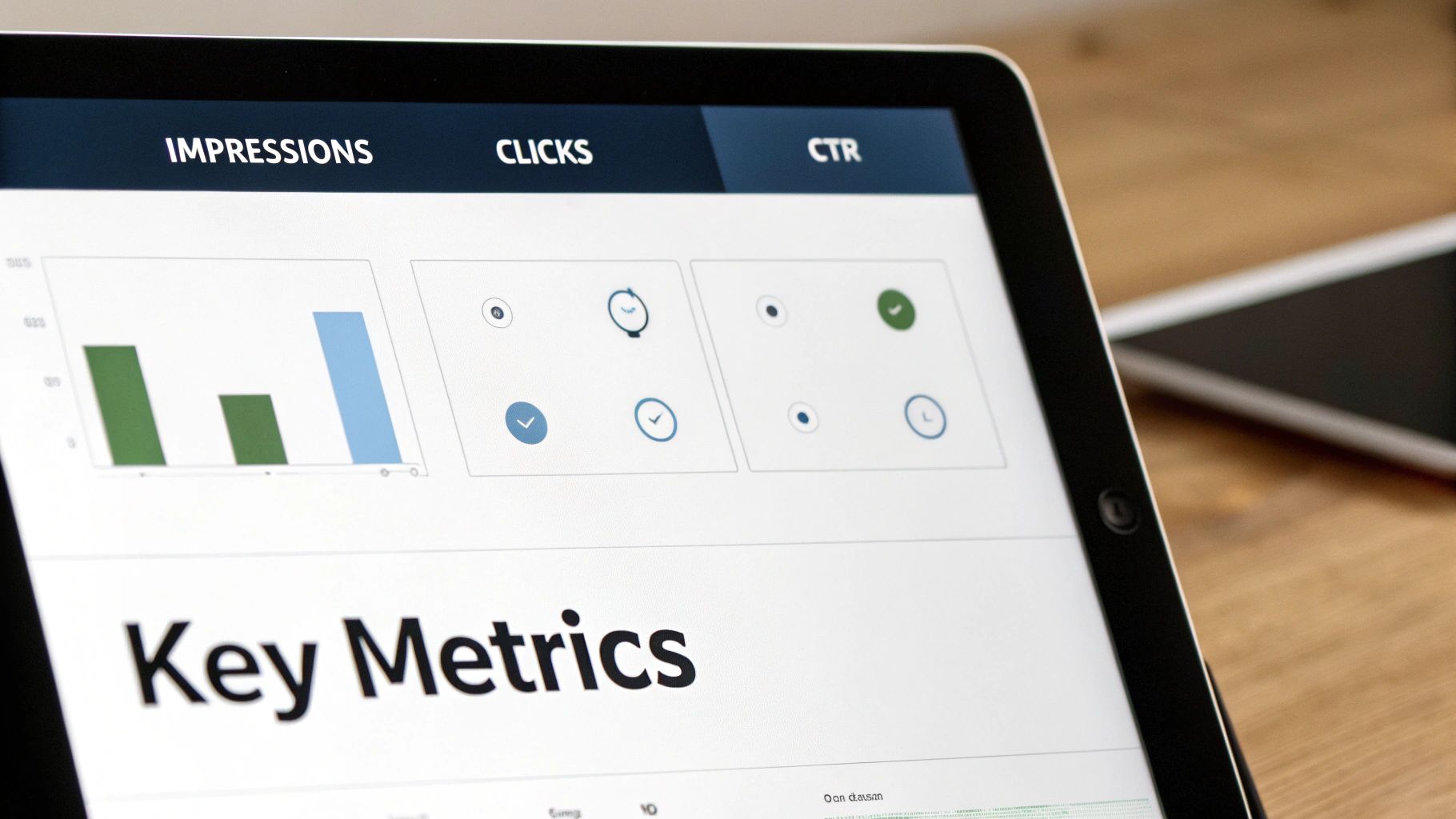
It’s incredibly easy to get lost in a sea of data. Open up your Google Ads dashboard, and you’re hit with dozens of columns, charts, and numbers. But here’s the secret: most of them are just noise.
A great pay per click report doesn’t just throw numbers on a page; it tells a story. It highlights what’s working, what’s broken, and where the real opportunities are hiding. The trick is knowing which numbers to focus on.
Beyond Clicks and Impressions
The first two metrics everyone sees are Impressions (how many times your ad was shown) and Clicks (how many people clicked it). They’re the building blocks, but on their own, they don't tell you much about whether you're actually making money.
That's where Click-Through Rate (CTR) comes in. CTR is simply the percentage of people who saw your ad and were interested enough to click. It’s your first real clue about whether your ad copy and targeting are hitting the mark. A low CTR is a sign that your message just isn't connecting with your audience.
But a high CTR isn't the finish line. What if you get thousands of clicks but not a single sale? That brings us to the metrics that really matter—the ones that connect your ad spend to your business goals.
Tying Performance to Profitability
This is where you find the real story. These metrics move past vanity numbers and measure the actual financial impact of your campaigns. They answer the one question every boss or client wants to know: "Are we getting our money's worth?"
Here are the heavy hitters you absolutely need to be watching:
- Cost Per Acquisition (CPA): This is what you pay, on average, for one conversion—whether that’s a new lead, a sign-up, or a sale. Want to get into the weeds on this one? You can learn more about why Cost Per Acquisition is such a make-or-break metric in our detailed guide. It's the ultimate measure of efficiency.
- Conversion Rate: This is the percentage of clicks that turn into a valuable action. A high CTR paired with a low conversion rate is a classic red flag. It usually means your ad is writing checks that your landing page can't cash.
- Return On Ad Spend (ROAS): For any business tracking revenue, this is the holy grail. It shows you exactly how much money you’re making for every dollar you put into ads. A ROAS of 4:1 means you’re generating $4 for every $1 spent.
The goal of a great report is to connect the dots. A high CTR is good, but a high CTR paired with a strong conversion rate and a positive ROAS is what actually grows a business.
Focusing on these bottom-line metrics turns your report from a boring activity summary into a powerful tool for making smart decisions. The conversation shifts from "How many people saw our ad?" to "How much revenue did our ads bring in?"
How Metrics Tell a Story Together
No single metric lives on an island. The real magic happens when you see how they all work together. A good pay per click report doesn’t just list KPIs; it explains their relationship.
To make this crystal clear, let's look at what each metric measures and the strategic question it helps you answer.
Key PPC Metrics and the Stories They Tell
This table breaks down the essential pay-per-click metrics, explaining what each one measures and the strategic question it helps you answer.
Understanding these connections is what turns raw data into something you can actually use. For instance, if your CPA starts climbing, you can immediately check your CTR and conversion rate to figure out why. Is the ad failing to attract the right people, or is the landing page failing to close the deal? That’s the kind of insight that leads to real improvements.
Choosing the Right Report for the Right Audience
Let's be honest: not all PPC reports are created equal. They shouldn't be. The high-level summary you show your CEO is completely different from what a PPC manager needs for their daily tweaks. The real secret to great reporting is knowing your audience and giving them exactly what they need—no more, no less.
Think of it like this: your CEO is in the helicopter, wanting the 30,000-foot view of the battlefield. Are we winning? Is the money we're spending actually working? Your PPC manager, on the other hand, is the commander on the ground, needing to know which specific battalion is advancing and which one needs air support, right now.
Giving everyone the same firehose of data is the fastest way to get your reports ignored. The key is to match the report's focus to the questions your audience is asking. When you do that, your reports provide clarity, not confusion.
Campaign Performance Reports: The Big Picture
This is your executive-level snapshot. A Campaign Performance Report rolls up all the essential metrics into a clean, high-level overview. It’s all about answering one main question: are our paid search efforts helping the bottom line?
- Who it's for: CEOs, VPs of Marketing, and other key stakeholders who care about results and ROI.
- What it answers: "Are our ad campaigns profitable?" and "How is our overall performance trending over time?"
- Key Metrics: Total Spend, Total Conversions, Cost Per Acquisition (CPA), and Return On Ad Spend (ROAS).
This report needs to be visual, simple, and straight to the point. Ditch the nitty-gritty details about ad groups or keyword match types. The goal here is to justify the budget and show the value of your marketing in clear, financial terms.
Keyword and Search Term Reports: The Ground-Level View
Alright, now we're moving from the boardroom to the trenches. A Keyword Report tells you how the specific terms you're bidding on are actually doing. It’s how you spot your all-stars and your benchwarmers, which is critical for figuring out where to shift your budget.
But the real gold is in the Search Term Report. This one shows you the exact queries people typed into Google right before your ad popped up. It’s the most direct, unfiltered feedback you can possibly get from your audience.
A Search Term Report is a treasure map for optimization. It not only reveals high-intent phrases you should be bidding on but also uncovers the irrelevant, money-wasting queries you need to add as negative keywords.
This is where a tool like Keywordme is a lifesaver. Trying to manually sift through thousands of search terms is a special kind of nightmare. Keywordme helps you spot those junk terms in a flash and add them to your negative keyword lists, which immediately stops wasted spending and makes your campaigns run leaner.
- Who it's for: PPC Managers, Digital Marketing Specialists, and agency teams doing the hands-on work.
- What it answers: "Which keywords are actually driving conversions?" and "What random searches are burning through my budget?"
- Key Metrics: Clicks, CTR, Conversion Rate, and Cost Per Conversion (all broken down by the individual keyword or search term).
Attribution Reports: Connecting the Dots
A customer's journey is almost never a straight line. They might see one of your ads on social media, click a search ad a week later, and then finally buy something after getting an email from you. An Attribution Report is what helps you piece that puzzle together.
Instead of giving 100% of the credit to the very last thing they clicked, attribution models spread that credit out across the different touchpoints. This gives you a much more realistic view of how your channels are actually working together to land a customer.
- Who it's for: Marketing Directors and strategists trying to understand the whole customer journey.
- What it answers: "What is the full impact of our PPC campaigns, beyond just the final click?"
- Key Metrics: Assisted Conversions, Time to Conversion, and Path Length.
When you understand the different roles these reports play, you can deliver precisely the right insights to the right people. This targeted approach transforms your PPC reports from a boring, routine task into a strategic tool that drives smarter decisions across the entire company.
How to Build Your First Insightful PPC Report
Alright, let's roll up our sleeves and get practical. Building a truly insightful pay per click report isn’t about some secret formula; it’s about having a solid process. The real goal is to create something people actually want to read because it tells a story about what's working, what isn't, and what to do next.
We're going to walk through building a powerful dashboard using tools you probably already use, like Google Ads and Google Looker Studio (which they've now just called Looker Studio). But before we even touch a chart or a graph, we need to nail the single most important step: figuring out who you're building it for.
Start With the Who and the Why
Every great report begins with two simple questions: Who is this for? And what do they really need to know?
A report for your CEO should look nothing like the one you give your marketing team. Answering these questions first is your best defense against creating a data-dump that gets ignored.
This little diagram breaks down how the reporting process changes depending on who's looking at it.
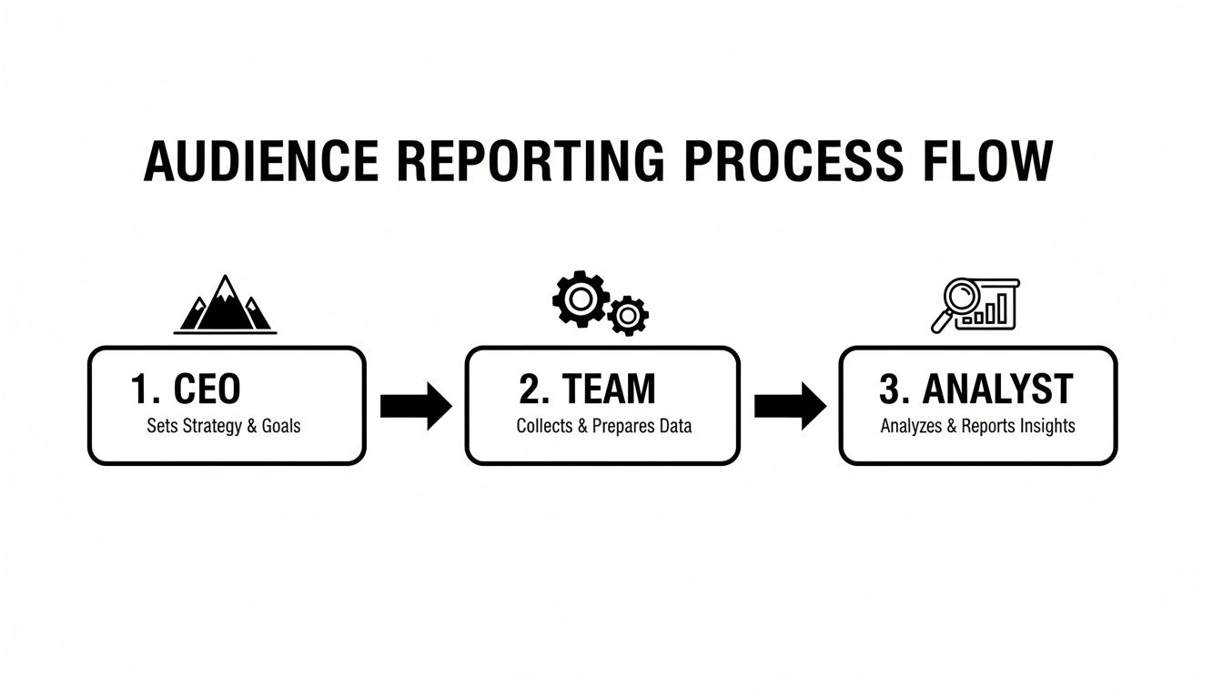
As you can see, the CEO just wants the high-level ROI. Your team needs the tactical data to make optimizations. The analyst needs to get into the weeds. Defining this upfront is everything.
Once you know your audience and their "why," the rest of the process just clicks into place. You'll instantly know which metrics to put front and center and which ones to leave in the appendix, keeping your report focused and valuable.
Connecting Your Data and Choosing Your Visuals
Now for the technical bit. The first step is to hook up your data source (like your Google Ads account) to your reporting tool (like Looker Studio). This is what allows the data to flow in automatically, saving you from the soul-crushing nightmare of exporting spreadsheets every week.
With your data connected, it's time to think visually. The right chart can make a complex idea feel simple, while the wrong one just creates more confusion.
Here’s a quick cheat sheet:
- Line Graphs: Perfect for showing trends over time. Use them to track things like ROAS, CPA, or total conversions on a weekly or monthly basis.
- Bar Charts: These are your go-to for direct comparisons. They’re great for showing how different campaigns, ad groups, or even devices are performing against each other.
- Scorecards: Just big, bold numbers. Stick these right at the top of your report for your most important KPIs, like total spend or total conversions, to give an immediate high-level summary.
And speaking of devices, you absolutely have to segment your data to see how mobile and desktop are performing. Mobile has completely changed the PPC game, driving the majority of all paid ad activity. By 2025, 52% of all clicks on PPC ads are expected to come from mobile. A staggering 70% of search ad impressions in the U.S. already happen on mobile.
This mobile-first reality means device-specific reporting isn't a "nice-to-have"—it's essential.
Structuring Your Report for Maximum Impact
How you lay out your report is just as important as the data inside it. A logical flow guides your reader from the big picture down to the nitty-gritty details. Think of it like a pyramid.
- Executive Summary (The Top): Start with the main takeaways. What were the big wins? The key challenges? A few sentences that give the reader the "so what?" right off the bat.
- High-Level KPIs (The Middle): This is where you put your scorecards and trend lines for the big-hitter metrics—ROAS, CPA, total conversions. This section provides the essential context for everything else.
- Detailed Breakdowns (The Bottom): Now you can dive deep. Show performance by campaign, ad group, and device. This is where your bar charts and tables will shine, providing the hard evidence to back up your executive summary.
If you’re just starting out, building from a blank slate can feel a bit much. To get a head start, check out these excellent PPC reporting templates that give you a solid foundation to build on. It also helps to see what others are doing, so explore these free Google Ads reports to get ideas on how to present your own data.
Following this structure ensures your report tells a clear story that actually drives action.
Common Reporting Mistakes and How to Avoid Them
A great report does more than just throw numbers on a page; it tells a story and helps you make smarter decisions. Too many reports are just data dumps—a spreadsheet filled with metrics that look important but don’t actually mean anything. This is the difference between a rookie move and a pro strategy.
The secret isn't more charts; it's adding a narrative. Don't just point out that performance dipped. Dig into why it dipped and—most importantly—what you’re going to do about it. That’s how a pay per click report goes from a boring summary to a strategic weapon.
Think of the following points as a quality-control checklist. Running your reports through this filter will make sure every one you send is clear, credible, and genuinely useful for improving your campaigns.
Focusing on Vanity Metrics
This is probably the most common trap. It's easy to get fixated on "vanity metrics"—numbers that look fantastic on the surface but have zero connection to actual business goals. Impressions are the classic culprit. Getting a million impressions sounds impressive, right? But if they didn't generate a single sale, who cares?
This usually happens when the person building the report doesn't have a firm grasp on what the campaign is really trying to achieve. You end up highlighting numbers that are easy to show off but don’t actually measure what matters.
To dodge this bullet, always work backward from the primary business objective.
- For e-commerce: Your north star is Return On Ad Spend (ROAS).
- For lead generation: Your most critical metric is Cost Per Acquisition (CPA).
The rule of thumb is simple: if a metric doesn't directly tie to revenue or new customers, it’s a supporting character, not the hero of the story. A report that leads with impressions is a report that's missing the entire point.
Creating Confusing Visuals
The whole reason we use charts and graphs is to make complex data easy to digest in a single glance. Unfortunately, it's shockingly easy to create a cluttered, confusing dashboard that just gives your boss a headache. Jamming too much data into one chart or using a 3D pie chart (a cardinal sin of data visualization) makes your hard-won insights impossible to understand.
A good visual tells a clear story instantly. You don't need to be fancy; you just need to be clear.
- Line charts are perfect for showing trends over time.
- Bar charts are great for comparing different categories.
- Scorecards are ideal for highlighting your main KPIs right at the top.
Keep your charts clean, label everything clearly, and give them some breathing room. Your goal is clarity, not complexity. If someone has to squint and ask, "What am I looking at?" your report has already failed, no matter how accurate the numbers are.
Failing to Segment Your Data
Listen, not all clicks are created equal. A click from a desktop user in California is a world away from a click from a mobile user in New York. If you don't segment your data, you're trying to analyze the entire forest by looking at a single leaf—you're missing the whole picture.
When you just look at the top-level numbers, you can't spot the hidden patterns that lead to real breakthroughs. For example, your campaign might look like it's tanking overall, but segmenting by device could reveal that mobile is crushing it while desktop is dragging the average down. Now that's an insight you can act on.
Here are the three essential segments you should include in every pay per click report:
- Device: How do desktop, mobile, and tablet users behave? Their intent and conversion paths are often wildly different.
- Location: Where are your best customers coming from? Pinpoint the cities, states, or countries driving real results.
- Audience: How are your various demographic, in-market, or custom audiences performing against each other?
Segmenting turns a vague number into a sharp, actionable insight. It’s how you graduate from knowing what happened to finally understanding why it happened—and that's the key to making better moves next month.
Frequently Asked Questions About PPC Reports
Even with the best guides, you're bound to have questions once you're elbows-deep in the data. Getting your head around pay per click reports isn't a one-and-done deal; it's a skill you build over time. So, it's completely normal to hit a wall or second-guess whether you're even looking at the right things.
To help you out, I've pulled together the most common questions I hear from other marketers and business owners. Think of this as your go-to cheat sheet for solving common problems and keeping your reporting sharp.
How Often Should I Run Pay Per Click Reports?
Ah, the classic question. The honest answer? It completely depends on who's looking at the report. There's no magic number here. The real key is to match the reporting cadence to the audience's needs, so you keep them in the loop without drowning them in data.
- Daily (For You): This isn't about a formal report. It's your quick, daily pulse-check on a live dashboard. As the one managing the campaigns, you need to be able to spot any wild swings—like a sudden spike in CPC or a nosedive in conversions—the second they happen.
- Weekly (For Your Team): A weekly summary is usually perfect for your internal marketing crew. It gives you enough data to see real trends and make smart tweaks, but it smooths out the meaningless day-to-day noise.
- Monthly or Quarterly (For Clients & Execs): When reporting up to clients or leadership, monthly or quarterly is the way to go. These reports should zoom out to show the big picture: high-level trends, overall ROI, and how you're tracking toward major business goals. Leave the nitty-gritty details out.
What Is the Single Most Important PPC Metric?
I'll be honest, this is a bit of a trick question. Why? Because there isn't one. The "most important" metric is simply the one that directly measures the main goal of your specific campaign. If you try to slap the same KPI on every campaign, you're going to end up with some seriously misaligned reporting.
The most important metric is always tied to your objective. Don't chase a vanity metric like impressions when your real goal is generating profitable sales.
For example, if you're running a campaign for an e-commerce site, your North Star is almost always Return On Ad Spend (ROAS). But what if you’re a B2B company trying to feed leads to your sales team? Then, your world probably revolves around Cost Per Acquisition (CPA). And for a brand awareness play, metrics like Impressions and reach suddenly take center stage.
Always start by defining what success looks like, then pick the metric that proves you're achieving it.
What Is the Difference Between a Keyword and a Search Term?
Nailing this distinction is non-negotiable for anyone serious about managing campaigns. They might sound like the same thing, but they represent two totally different pieces of the puzzle in your Google Ads account. Understanding the difference is where the real optimization magic happens.
- A keyword is what you, the advertiser, tell Google you want to bid on. It's the target you set in your account (e.g., 'womens waterproof boots').
- A search term is the actual, messy, real-world query a person typed into Google that triggered your ad (e.g., 'best price for womens waterproof boots near me').
Your Search Term Report is an absolute goldmine. It's where you'll unearth amazing long-tail keywords you never would have thought of, and just as important, it's where you'll find all the irrelevant junk searches you need to add as negative keywords to stop hemorrhaging cash.
Can I Automate My PPC Reporting?
Not only can you, but you absolutely should. In fact, automating your reporting is one of the biggest upgrades you can make to your entire workflow. It saves you from hours of soul-crushing, repetitive work and drastically cuts down on human error. Let's face it, nobody enjoys copying and pasting numbers into a spreadsheet first thing Monday morning.
Tools like Google's Looker Studio or dozens of other third-party platforms can plug directly into your Google Ads account. Once you set them up, they pull your data and refresh your charts for you, completely on autopilot.
You can then schedule these reports to be automatically emailed to your stakeholders. This gets you out of the manual reporting grind and frees you up to spend time on what actually matters: analyzing the data, forming a strategy, and making the optimizations that will move the needle.
Ready to stop wasting ad spend and streamline your optimization process? The insights from your pay per click reports are only as good as the actions you take. Keywordme helps you turn those insights into action, making it faster and easier than ever to add negative keywords, discover new opportunities, and boost your campaign ROI. Start your free trial and see the difference for yourself.