Build a Pay Per Click Report That Wows Clients
Build a Pay Per Click Report That Wows Clients

A good pay per click report isn't just a data dump; it's your campaign's story. It translates all the numbers and metrics into a clear picture of what’s working, what isn’t, and how your budget is translating into real results. Think of it less as a scorecard and more as a strategic map that guides your next move.
Building a Foundation for Your PPC Report
Before you even touch a reporting tool, the most important work needs to happen. A truly great pay-per-click report is built on a solid foundation of clear, agreed-upon objectives. Skip this step, and you’re just throwing numbers at people without any context or narrative. Your report will land with a thud.
This is all about getting on the same page. You have to sit down with your clients, your boss, or whoever holds the budget and define what "success" actually means for the business. This conversation needs to go way beyond vanity metrics like clicks and impressions and cut straight to what really moves the needle.
Defining Your Core Objectives
Every business is different, and so is every campaign. Your first job is to figure out the why. Is the goal to flood the sales pipeline with qualified leads? Is it all about driving e-commerce sales? Or maybe the focus is on carving out more brand visibility in a crowded marketplace.
To nail this down, you need to ask the right questions:
- What’s the ultimate business goal here? (e.g., "We need to grow revenue by 15% this quarter," or "Our target is 100 new MQLs per month.")
- What specific action do we want someone to take after clicking our ad? (e.g., submit a form, buy a product, subscribe to our email list.)
- What is a new customer or lead actually worth? This is crucial for setting a realistic target Cost Per Acquisition (CPA).
You absolutely have to track these actions accurately, which is non-negotiable. For most advertisers, this means properly setting up Google Ads conversion tracking to make sure every valuable interaction is counted.
Aligning Goals with Business Outcomes
Once you have the answers, you can start connecting the dots between your campaign metrics and tangible business outcomes. This is how you prove your worth and justify every dollar of ad spend. It’s like creating a blueprint for your report—every single piece of data you present later on should tie back to these core objectives.
Getting this alignment right from the start is so important, especially when you consider the money being poured into this space. The global search advertising market is expected to hit a massive $351.5 billion in 2025. You can dig into those market projections to see just how dominant the United States is in this trend.
This is where tools like Keywordme come in handy right from the get-go. You can make sure your keyword strategy is perfectly aligned with those high-level business goals from day one.
A view like this helps you pick keywords based not just on search volume, but on their commercial intent and how likely they are to drive the specific conversions you care about.
Key Takeaway: A successful pay per click report isn't about showing all the data; it's about showing the right data. That process starts by defining clear business objectives with stakeholders before you even think about building the report.
Choosing the Metrics That Actually Matter
Opening up a PPC report can feel like you're staring at a giant spreadsheet of endless numbers. Clicks, impressions, costs, conversions... it's easy to get lost. The secret to a great report isn't tracking everything. It's about zeroing in on the numbers that tell you if your campaigns are actually working.
Your Key Performance Indicators (KPIs) are the stars of the show. These are the metrics that directly answer the big question from your boss or client: "Are we hitting our goals with this ad spend?" They're the bridge between your campaign activities and real business results.
Think about it this way. If you're running a campaign for a B2B software company, your most important metric is probably Cost Per Acquisition (CPA). This tells you exactly what you're paying for each qualified lead. For a deeper look at this crucial metric, check out our guide on what is cost per acquisition. On the flip side, an e-commerce store lives and dies by Return On Ad Spend (ROAS)—the revenue you earn for every dollar you spend.
This decision tree is a great way to quickly map your business objective to the right KPIs.
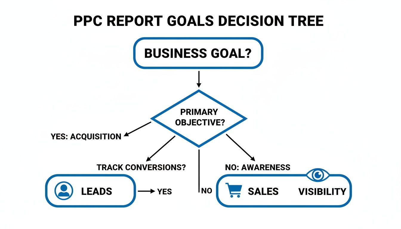
As you can see, following the path from your main goal helps you cut through the noise and focus on what truly matters.
Primary KPIs: The Non-Negotiables
These are the metrics that deserve a permanent, front-and-center spot in every single report you build. They speak the universal language of PPC performance.
- Conversions: This is the whole point, right? A conversion could be a sale, a form fill, or a phone call. It's the proof that your ads are driving the action you want.
- Cost Per Conversion / CPA: This one is all about efficiency. A low CPA means you're getting new customers or leads without breaking the bank.
- Return On Ad Spend (ROAS): If your campaign is tied to revenue, ROAS is king. It’s the clearest way to show the profitability of your advertising.
- Click-Through Rate (CTR): This measures how compelling your ad is. A high CTR means your message and targeting are resonating with the right people.
Digging Deeper with Secondary Metrics
While your primary KPIs tell you what happened, secondary metrics help explain why. They provide the context that turns a simple data dump into a strategic analysis. Think of them as the supporting cast that makes the story complete.
A perfect example is Impression Share. This metric tells you how often your ads were shown versus how often they could have been shown. If you have a low impression share on a campaign that's converting like crazy, that's a huge red flag! It means you're leaving money on the table and should probably think about upping your budget or bids.
Another crucial one is Quality Score. This is Google's rating of your keyword and ad relevance. A higher Quality Score doesn't just feel good; it can lead to lower costs and better ad positions. It’s a direct reflection of how well you've aligned your keywords, ad copy, and landing page experience.
A great report doesn't just list data; it connects the dots. It shows how a 2-point increase in Quality Score led to a 15% drop in Cost Per Click, which in turn improved the overall campaign ROAS.
To help you decide which metrics to feature in your report, here's a quick breakdown based on common campaign goals.
Essential PPC KPIs for Different Campaign Goals
This table should make it easier to tailor your report to what stakeholders really care about, ensuring every metric you present has a purpose.
The Role of Cost Per Click
Understanding how much you pay for each click is fundamental. Cost Per Click (CPC) is your window into market competition and how efficient your bidding strategy is. And the competition is definitely getting steeper.
The average CPC across all industries hit $5.26 in 2025, a significant 12.88% jump from the previous year. This signals that bidding wars are heating up, especially in sectors like legal services, which now sees an average CPC of $8.58.
For many businesses, especially in local services, leads don't just come from website forms. Tracking inbound phone calls is absolutely critical. If you're not doing it, you're missing a huge piece of the puzzle. This guide on Google Adwords call tracking is a great resource for getting that set up.
By weaving these primary and secondary metrics together, your report goes from being a simple summary to a powerful strategic tool that drives real decisions.
Structuring Your Report for Maximum Impact
Alright, you've got your goals locked in and you know which KPIs to track. Now for the fun part: putting it all together. A truly effective pay per click report isn't just a data dump; it’s a story. And like any good story, it needs a clear beginning, middle, and end to keep your audience—whether it's your boss or a client—hooked.
How you organize this information is everything. It can be the difference between a client’s eyes glazing over and them getting genuinely excited about what’s next. You want to create a narrative that makes perfect sense, even to someone who doesn't live and breathe PPC.
Start with a Powerful Executive Summary
Let's be real: your stakeholders are busy. The single most valuable piece of your report is the executive summary you put right at the top. This isn't just a warm-up; it's the whole story in a nutshell, answering their two biggest questions right away: "How did we do?" and "What's next?"
Think of it as the highlight reel. It delivers the most critical takeaways before they even have to scroll.
- Top-Level Performance: Get straight to the point. Did you hit the main goal? For example, "We generated 120 qualified leads this month, flying past our target of 100 by 20%."
- Key Wins: Spotlight one or two big successes. Something like, "The new 'Emergency Services' campaign was a home run, driving a 35% jump in phone call conversions."
- Major Challenges: Don't hide the bad news. Be transparent. "Performance on the Display Network took a hit, and we suspect it's due to more aggressive competitor bidding."
- Quick Recommendations: Give them a sneak peek of your plan. "Next month, we're shifting focus to optimize display targeting and will reallocate some of that budget to the winning 'Emergency' campaign."
This upfront summary shows you respect their time and sets the stage for everything else. All the detailed charts and numbers that follow simply act as the evidence for what you've already told them. It makes the rest of the report so much easier to digest because they already know the ending.
Create a Logical Flow from Broad to Specific
Once the summary has set the scene, you need to guide your reader on a journey. Start with the 10,000-foot view and then slowly zoom in on the details. This top-down approach is crucial for preventing overwhelm and building a clear narrative.
Think of yourself as a tour guide. You wouldn't start a city tour by describing the doorknob on a single building; you'd show them the entire skyline first. Same logic applies here.
A solid report flow usually looks something like this:
- Overall Performance Trends: Kick things off with the big picture. Use clean charts to show trends over time for your main KPIs—think total conversions, overall ROAS, and total spend. This is where you provide crucial context by comparing this period to the last one (month-over-month) and the same time last year (year-over-year).
- Campaign-Level Breakdown: Now, zoom in a bit to the individual campaigns. This is where you start to reveal which strategies are pulling their weight and which ones are lagging. A simple bar chart or table comparing conversions and CPA by campaign is incredibly powerful here.
- Ad Group Deep Dive: For your most important campaigns, dig into the ad group performance. This layer of detail starts to answer the why behind a campaign's success or failure.
- Top-Performing Keywords and Ads: Finally, get down to the most granular level. Showcase the specific keywords and ad copy that are driving real results. This is the tangible proof of what messages are actually connecting with your audience.
Pro Tip: Never just drop a chart or table and walk away. Always add a sentence or two of your own commentary. Next to a list of your best keywords, you could write: "Notice how long-tail keywords containing 'emergency' are giving us our lowest CPA? This confirms our strategy to double down on these high-intent searchers."
This structure methodically builds your case, making your final recommendations feel less like a suggestion and more like the only logical conclusion.
Bring Your Data to Life with Clear Visuals
Let’s be real for a second. Nobody wants to squint at a spreadsheet filled with endless rows of numbers. It’s boring, it’s confusing, and worst of all, the key insights get completely lost. If you want your clients to actually get what's happening with their campaigns, you have to show them, not just tell them.
That’s where visuals come in. This is your chance to transform those crucial KPIs into charts and graphs that tell a clear, compelling story. The point isn't to make the report look flashy; it's to make complex data instantly understandable. A well-designed chart can reveal a trend in seconds—something that would take an entire paragraph to explain otherwise.
This is what I'm talking about. A clean, visual-first dashboard makes the important stuff pop.

You can immediately see where users are coming from and how they’re engaging, all without having to hunt through a single spreadsheet cell.
Picking the Right Chart for the Job
Not all charts are created equal, and throwing your data into the wrong one can be just as confusing as not using one at all. Picking the right visual is everything.
Here’s a quick rundown I use to match the data to the visual:
- Line Graphs for Trends: Need to show how clicks or conversions have tracked over the last six months? A line graph is your best friend. It’s perfect for spotting performance trends over time, whether they're heading up or down.
- Bar Charts for Comparisons: Trying to show which of your three campaigns is the top performer? A bar chart makes it incredibly easy to see who's winning on conversions or has the lowest CPA. Simple and effective.
- Pie Charts for Composition: These work well for showing parts of a whole, like the device breakdown (mobile vs. desktop) for your ad spend. A word of caution: keep the slices to a minimum. Anything more than a few categories becomes a cluttered mess.
- Funnels for Conversion Paths: If you really want to show the customer journey—from the first click to the final sale—a funnel visualization is the way to go. It brilliantly highlights where you're losing people along the way.
My Pro Tip: Before you even think about making a chart, ask yourself one simple question: "What is the single most important insight I want someone to take away from this?" The answer will point you to the right visual every time.
Put Your Visuals on Autopilot with Google Looker Studio
Manually building charts month after month is a soul-crushing time suck. This is where a tool like Google Looker Studio (what we used to call Data Studio) completely changes the game.
Looker Studio lets you connect directly to your Google Ads and Google Analytics accounts to build live, interactive dashboards. You do the setup work once, and it automatically pulls in fresh data forever. No more exporting, no more formatting, no more wrestling with chart settings in Excel.
You can create a professional, branded dashboard that your clients can access anytime they want. It's a huge step up in transparency and frees you up to spend your time on what really matters—improving campaign performance. If you need some ideas to get started, checking out different PPC reporting examples can be a great source of inspiration.
Make Your Visuals Impossible to Misinterpret
Even a beautiful chart is useless if it’s confusing. The final step is to add context so your story hits home.
A few finishing touches can make all the difference:
- Brand Everything: Add your client’s logo and use their brand colors. It feels bespoke and shows you’ve put in the extra effort.
- Use Clear Titles & Labels: Don't make people guess what they're looking at. "Campaign Performance: Clicks vs. Conversions" is way better than "Chart 1." Label your X and Y axes clearly.
- Add Annotations: This is a veteran move. See a huge spike in conversions on a certain day? Add a small note right on the graph explaining what happened (e.g., "20% off promo launched"). This transforms you from a data-puller into a strategic partner.
When you nail your visuals, you stop just showing numbers. You start revealing the powerful story behind them.
Turning Data into Actionable Insights
Alright, so you've got a sharp-looking report packed with accurate data. Great start, but that’s only half the job. This next part is what really separates a PPC pro from a number-cruncher. Raw data is just noise without context; your real value comes from explaining the why behind the numbers.

This is where your report stops being a history lesson and becomes a roadmap for the future. It’s your chance to show you’re connecting campaign performance to what’s actually happening in the real world.
Connecting the Dots Beyond the Dashboard
Performance doesn't happen in a vacuum. Your report needs to tell the full story.
Did a new competitor launch an aggressive campaign last month? That could easily explain a dip in your Impression Share. Or maybe a big seasonal sale just ended, causing a predictable drop in conversions. That’s the kind of context that matters.
Your analysis here is where you get to show off your market knowledge. It proves you aren’t just passively watching graphs go up and down—you’re interpreting the signals and thinking about what’s coming next.
For instance, a sudden spike in your Click-Through Rate (CTR) is rarely just a fluke. You need to dig in. Your report should be able to say something like, "The new '24/7 Support' ad copy we launched on the 15th was a huge win, boosting CTR by 45% in just two weeks. This tells us our audience really values messaging around reliability."
Crafting Recommendations That Actually Drive Action
The recommendations section is, without a doubt, the most valuable part of any PPC report. This is where you lay out a clear, confident plan based on what you’ve learned from the data. Vague suggestions like "let's improve performance" are useless. Your recommendations have to be specific, measurable, and tied directly to your client’s goals.
Here’s what powerful, action-oriented recommendations look like in practice:
- Smart Budget Shifts: "Our 'Commercial HVAC' campaign is crushing it with a 30% lower Cost Per Conversion. I recommend we move 15% of the budget from the underperforming 'Residential Maintenance' campaign to double down on what’s working."
- Plugging the Leaks: "I combed through the search term report and found we're wasting money on irrelevant queries like 'free training' and 'DIY jobs.' I’ve already added these as negatives and will keep an eye out for more."
- Fixing the Landing Page: "Our ads are getting plenty of clicks, but the landing page conversion rate is lagging. Let's run an A/B test next month with a stronger headline and a simpler form to see if we can reduce friction and get more leads."
This is the stuff that gets clients excited. They see you have a proactive strategy to get them better results, not just a fancy document telling them what already happened.
To really ground your insights, it’s worth brushing up on proven frameworks for measuring marketing campaign effectiveness.
Using Tools to Find the Hidden Gems
Don't just stick to the standard Google Ads interface. The right tools can help you uncover insights that are buried deep in the data. A platform like Keywordme, for example, is fantastic for digging into search term reports to find those little pockets of wasted spend or untapped opportunities.
Let’s say you're running a campaign for a local plumber. The main report shows conversions are coming in, which is good. But after running the raw search terms through a tool, you discover that a huge chunk of your best leads come from keywords that include "emergency service."
That’s not just an interesting fact—it’s a strategic goldmine.
Your recommendation can now be laser-focused: "Let's create a dedicated 'Emergency Plumbing' ad group with hyper-specific copy and its own landing page that speaks directly to that urgent need." This is the kind of insight that can totally transform a campaign and prove your strategic worth. By translating data into a clear story and an actionable plan, your PPC report becomes an indispensable tool for success.
Your Top PPC Reporting Questions, Answered
Alright, so you’ve got the templates and the tools, but putting together a truly great pay per click report still brings up some tricky, real-world questions. I've been there. Let's run through some of the most common ones I hear from other PPC pros.
Think of this as the stuff you might ask a colleague over coffee. Getting these details right is what separates a decent report from one that actually drives strategy and makes you look like a rockstar to your clients.
How Often Should I Send a PPC Report?
Ah, the million-dollar question. For the vast majority of my clients, monthly is the magic number. It’s the perfect cadence—long enough to gather enough data to spot real trends, but frequent enough to stay agile. Anything shorter, and you're often just reacting to noise.
That said, there are definitely exceptions. If I’m kicking off a brand new campaign or onboarding a new client, I'll often suggest a bi-weekly report for the first month or two. It’s a great way to show early progress and build that initial layer of trust.
My Two Cents: Start with monthly, but don't be rigid. The real goal is timely insight, not just hitting a deadline. Always, always hash out the reporting frequency with your stakeholders right at the beginning.
What Are the Best Free Tools for PPC Reporting?
You absolutely do not need to drop a ton of cash on expensive software to produce killer reports. Seriously, Google’s own suite of free tools is a powerhouse if you know how to use it.
- Google Looker Studio: This is the king of free reporting tools, hands down. It plugs right into your Google Ads and Analytics accounts, letting you build slick, automated, and interactive dashboards that will wow any client.
- Google Sheets: Never underestimate the power of a good old-fashioned spreadsheet. I use Sheets all the time for the nitty-gritty analysis—cleaning up raw data, creating custom formulas, and staging everything before it goes into a visual dashboard.
When you use these two together, you get the best of both worlds. You’ve got the deep analytical muscle of Sheets paired with the beautiful, shareable visualizations of Looker Studio. It's a combo that rivals a lot of paid platforms.
How Do I Explain Poor Performance to a Client?
This is probably the most dreaded part of the job, but every single one of us has to do it. The only way through it is with radical honesty and a proactive game plan. Don't ever try to sugarcoat the numbers or hide bad news. Clients are smart; they'll see it, and you’ll torch any trust you've built.
My approach is to hit it head-on, right in the executive summary. First, I state exactly what happened, no excuses. Then, I immediately follow up with my analysis of why. Was it a seasonal dip? Did a new competitor with deep pockets just enter the auction and drive up CPCs?
The most critical part? You have to come to the table with a clear plan of action. I lay out the specific, concrete steps I’m taking to right the ship. This completely changes the conversation from "Why did this happen?" to "Okay, I see you have a plan." It shows you're in control and turns a potentially awkward conversation into a chance to showcase your strategic expertise.
What Is One Thing People Forget to Include in Their Report?
It's amazing how often I see this, but the single most common omission is context. A report that just spits out this month's numbers is basically useless. Is a 5% conversion rate fantastic or a total disaster? Without any context, it's just a number floating in space.
A truly valuable pay per click report always provides a frame of reference.
- Month-over-Month (MoM): How are we tracking against last month? This is great for showing short-term momentum and the impact of recent changes.
- Year-over-Year (YoY): How did this October compare to last October? This is non-negotiable for spotting seasonal trends and proving long-term growth.
This comparative data is what transforms a boring list of metrics into a compelling performance story. It’s what gives the numbers meaning and helps everyone make smarter decisions.
Ready to stop wasting hours on manual keyword cleanup and start building high-performing campaigns faster? Keywordme plugs right into your Google Ads workflow, letting you manage negative keywords, expand ad groups, and optimize match types with a single click. See how much time you can save with your free 7-day trial.